


More projects
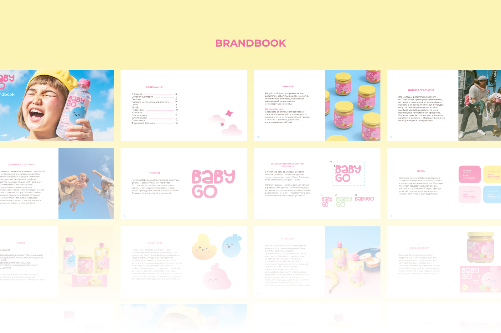
BABY GO — Playful rebranding for Detsky Mir
р.
р.
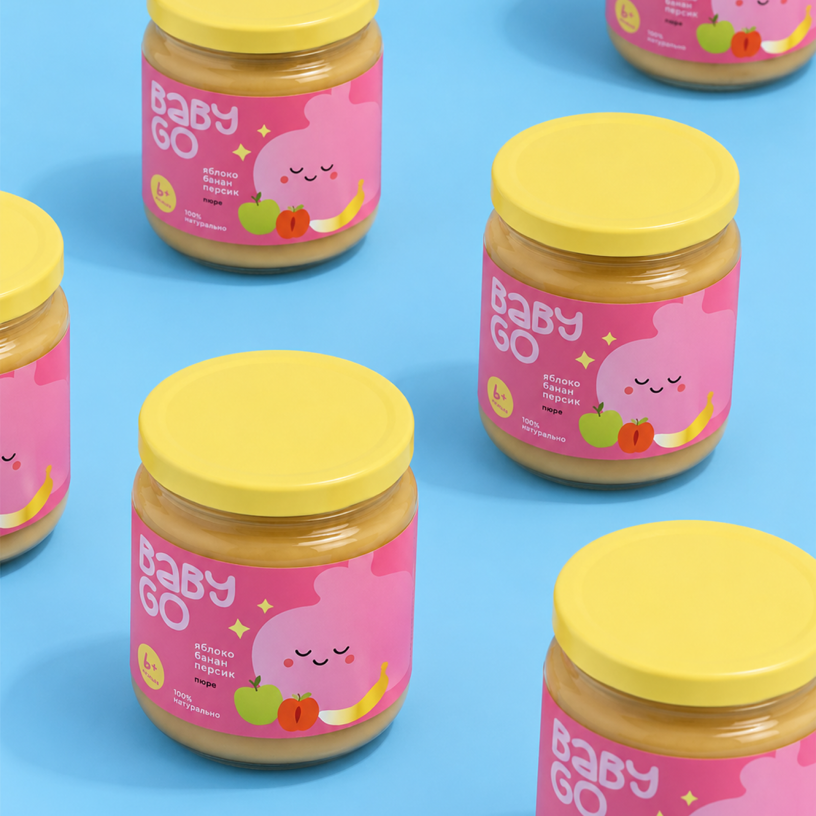
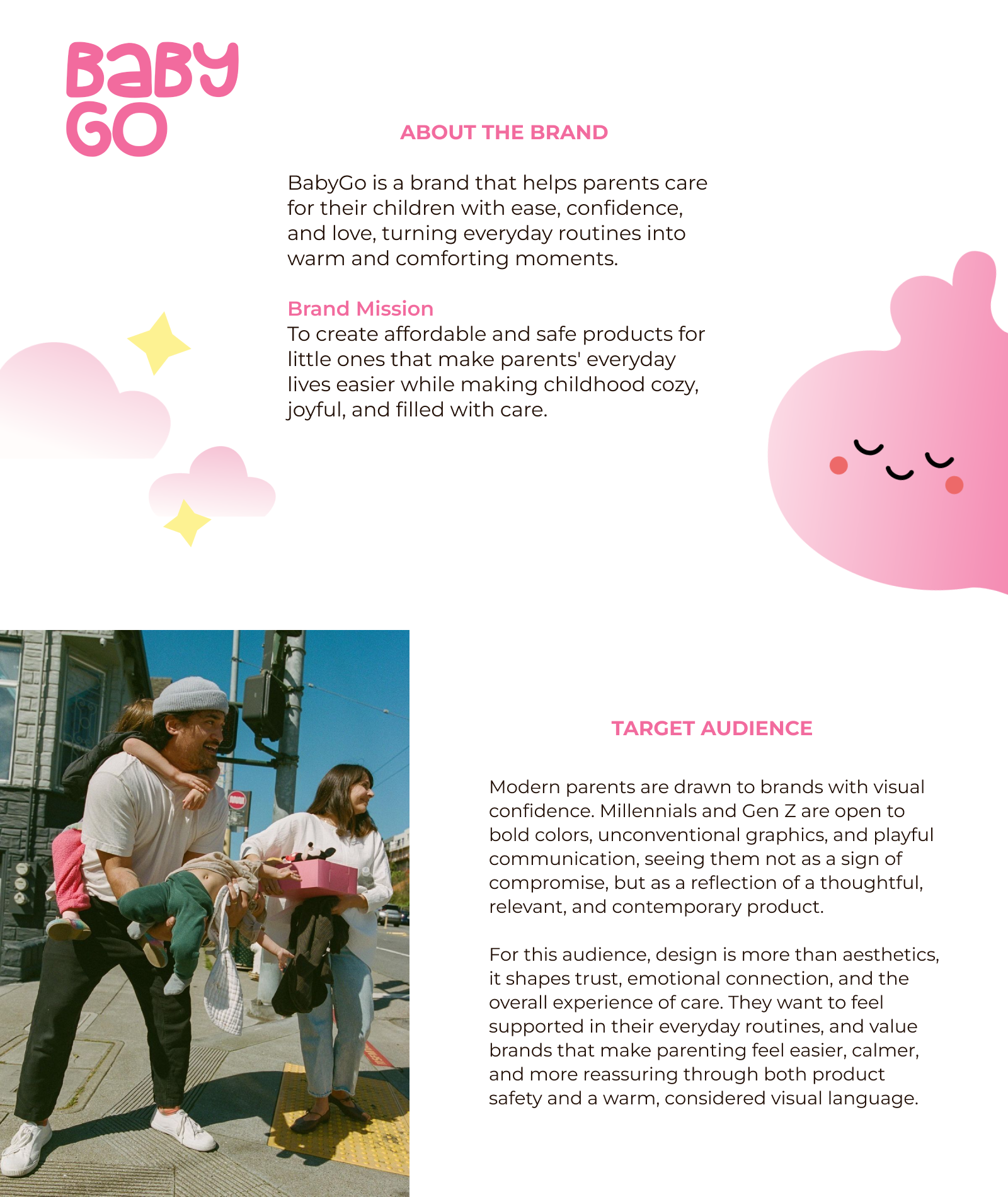
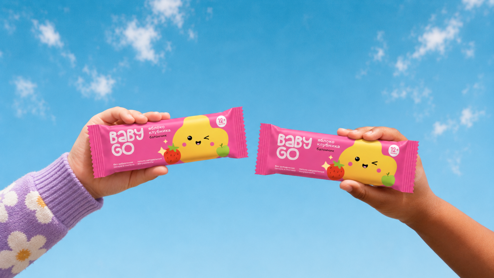
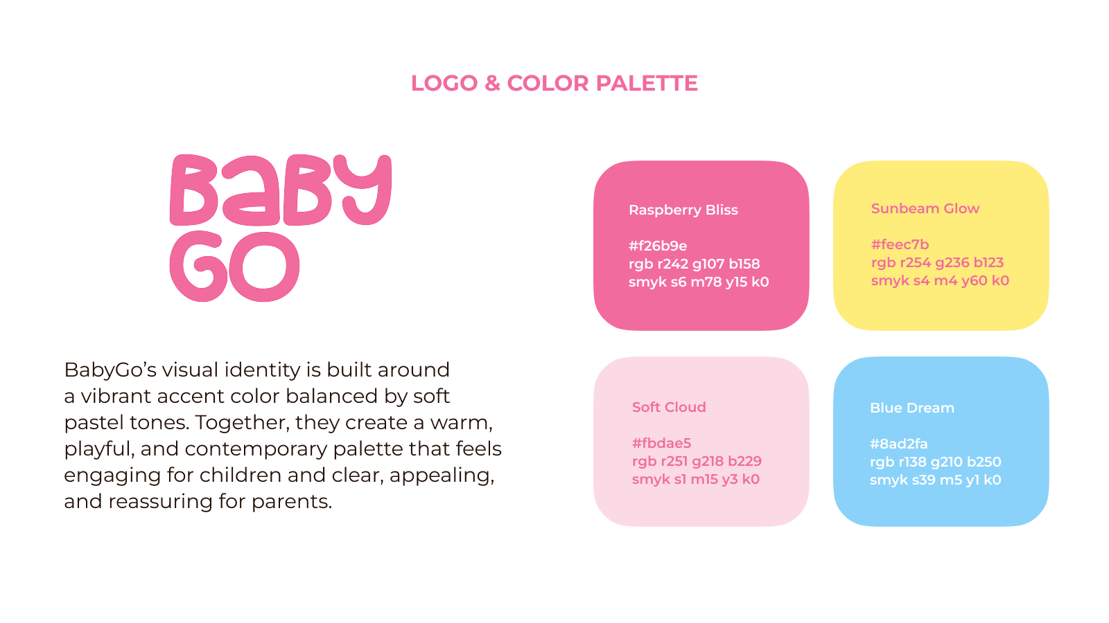
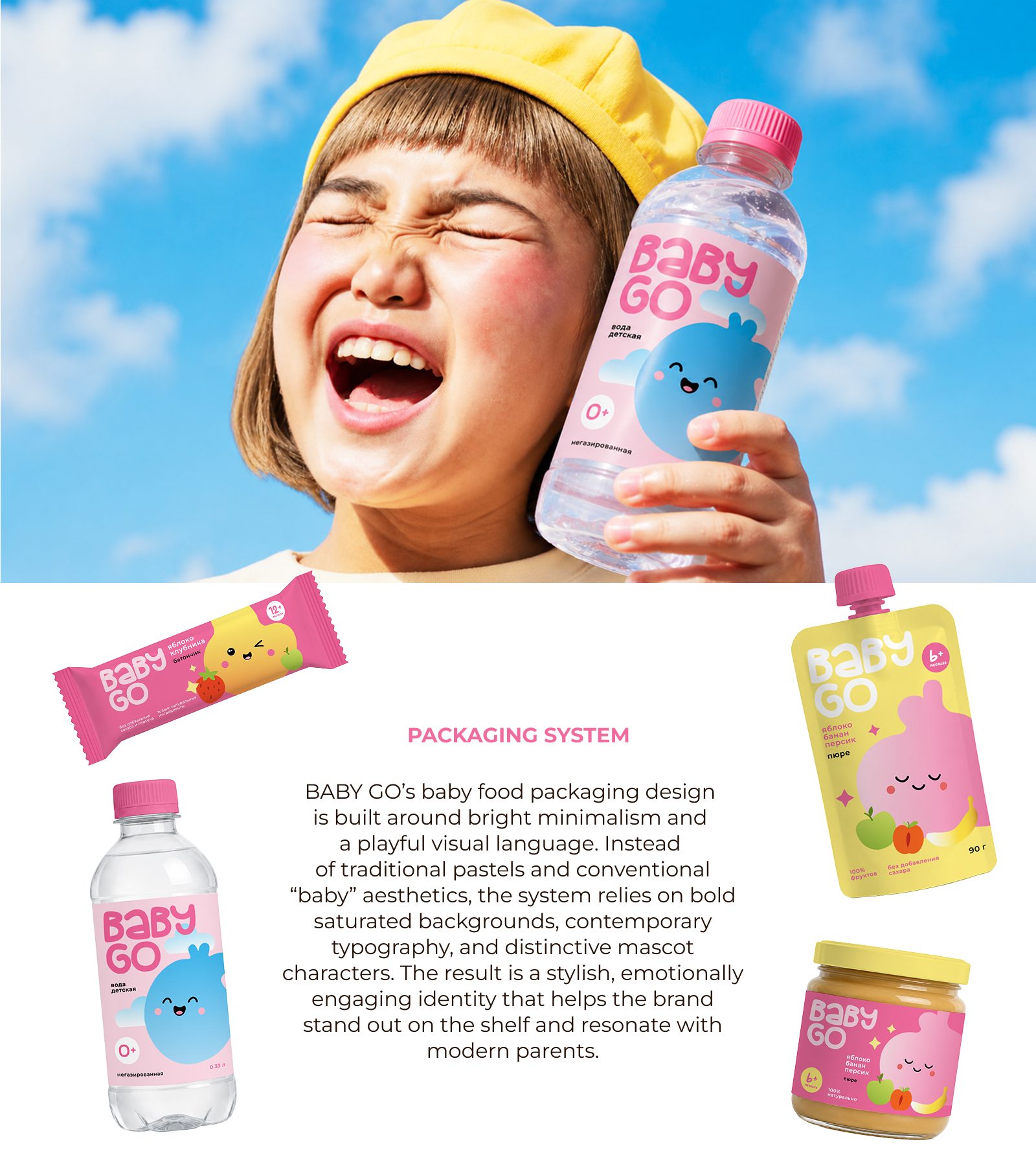
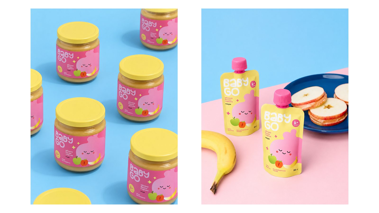
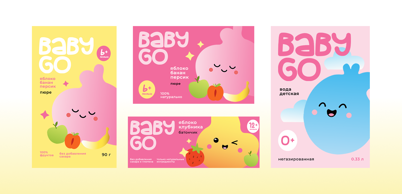
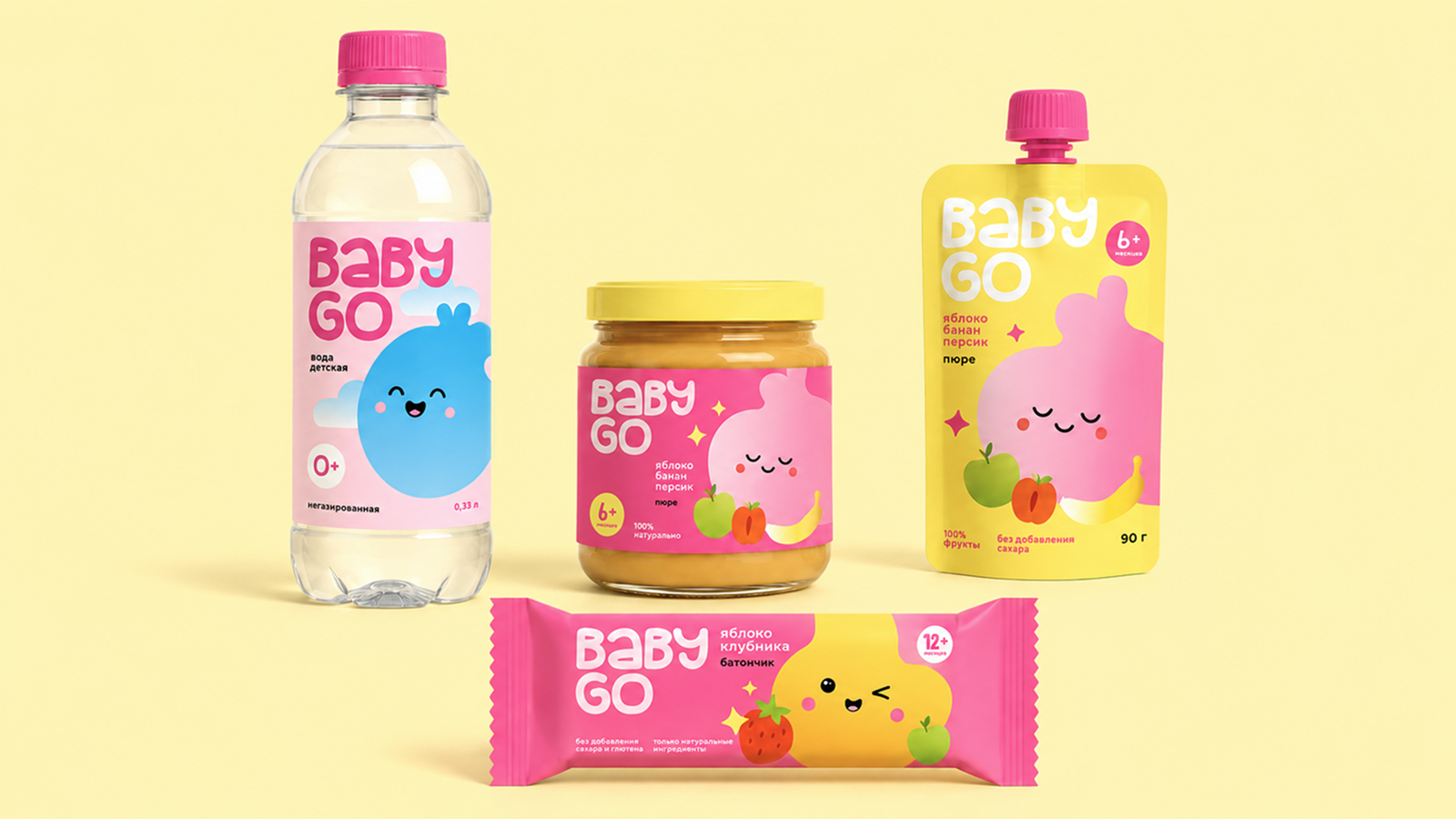
BABY GO is a playful rebranding concept for Baby Go, Detsky Mir’s in-house baby and kids brand. The project focuses on refreshing the visual identity of its baby food line through a redesigned logo and packaging system. Combining bright minimalism, bold color blocking, contemporary typography, and friendly mascot characters, the concept creates a modern and emotionally engaging visual language for young parents and their children.
link to the project on Behance: BABY GO — Playful rebranding for Detsky Mir :: Behance
link to the project on Behance: BABY GO — Playful rebranding for Detsky Mir :: Behance
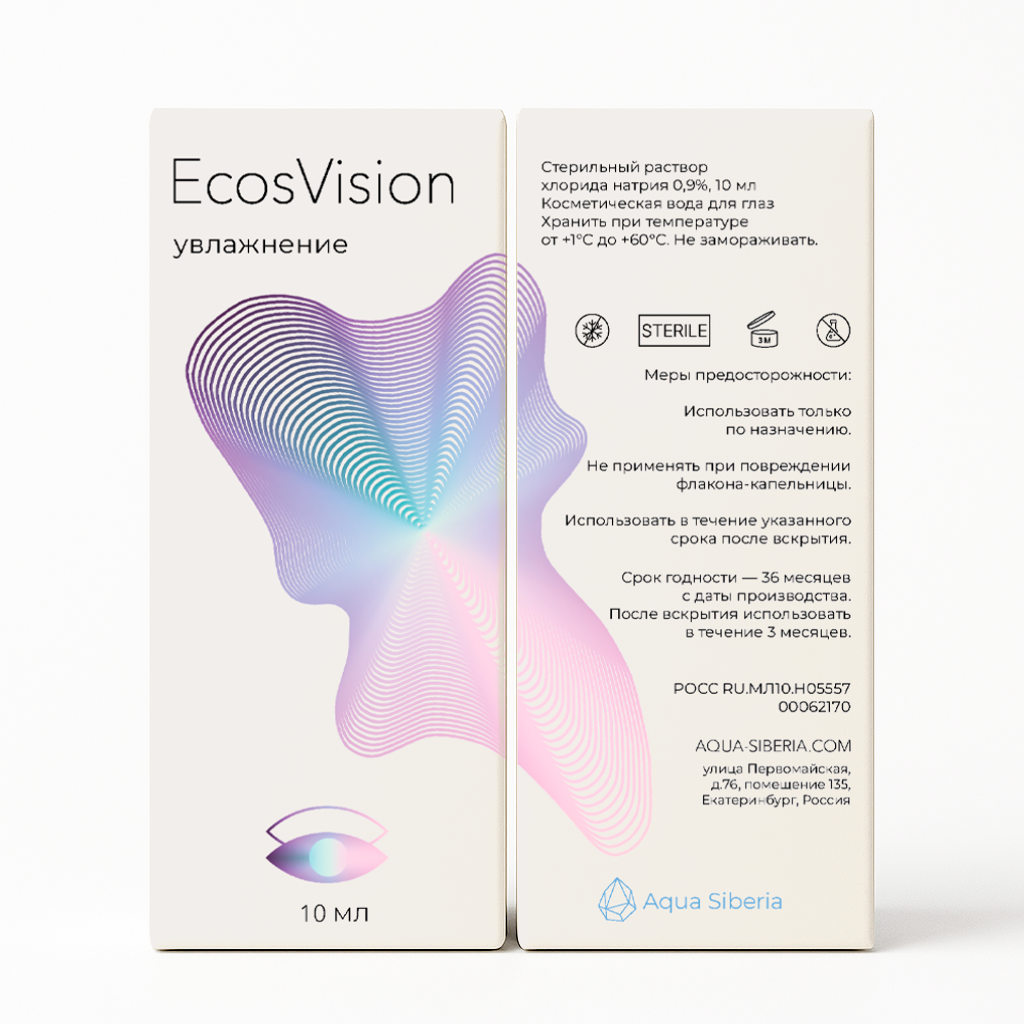
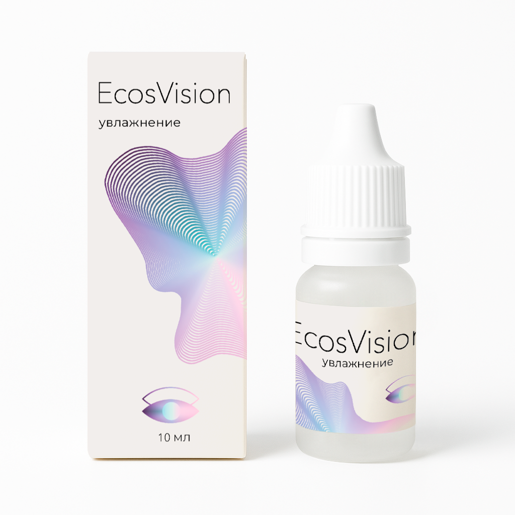
EcosVision — packaging design for eye care product
р.
р.
Packaging design for EcosVision cosmetic eye drops.
The visual concept is based on an abstract form inspired by the Northern Lights and the fluidity of water. Cool iridescent gradients help convey a sense of purity, freshness, and gentle care. Minimalist typography and a light color palette emphasize the character of the product while maintaining a modern and aesthetically refined brand presentation.
The visual concept is based on an abstract form inspired by the Northern Lights and the fluidity of water. Cool iridescent gradients help convey a sense of purity, freshness, and gentle care. Minimalist typography and a light color palette emphasize the character of the product while maintaining a modern and aesthetically refined brand presentation.
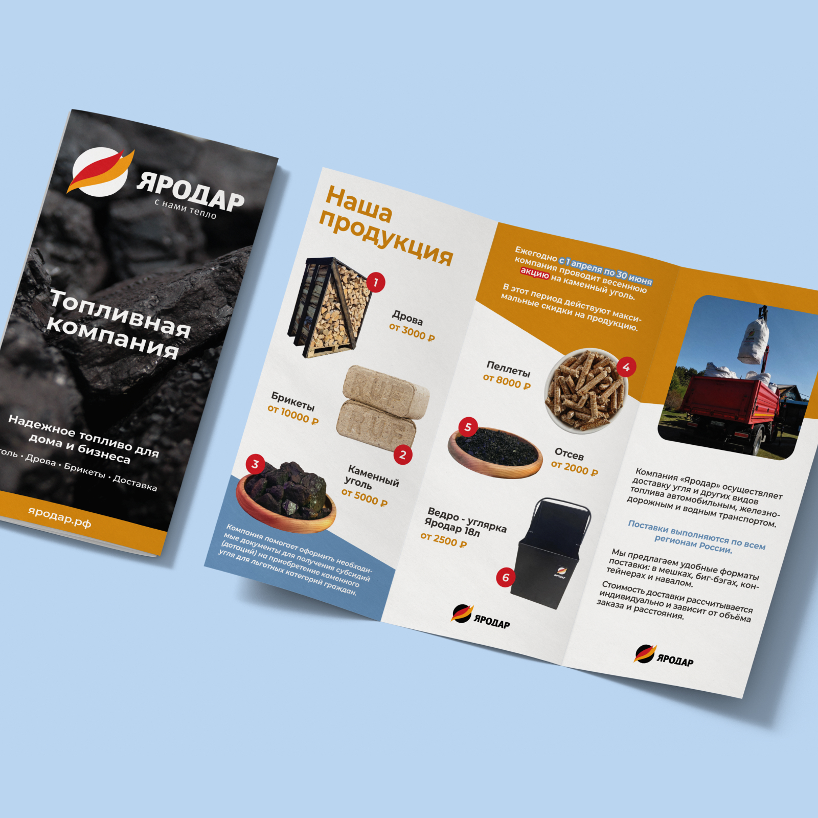
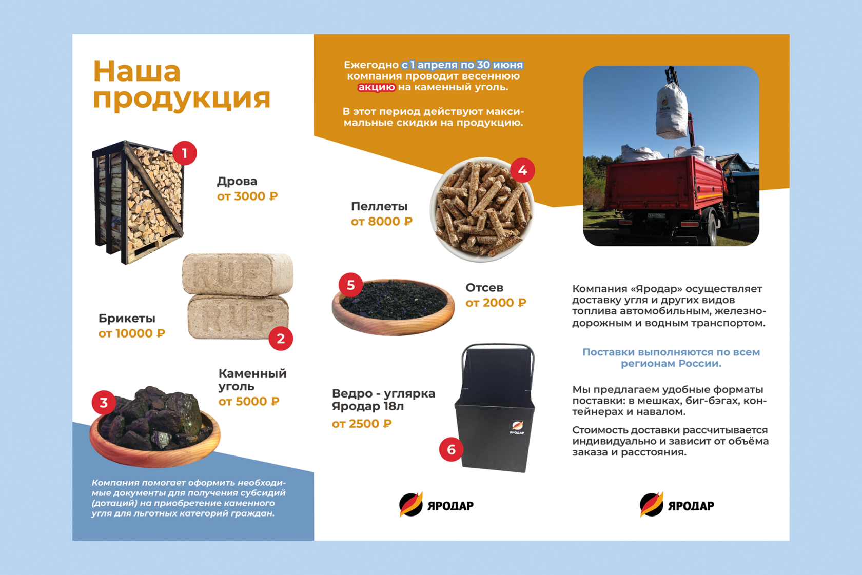
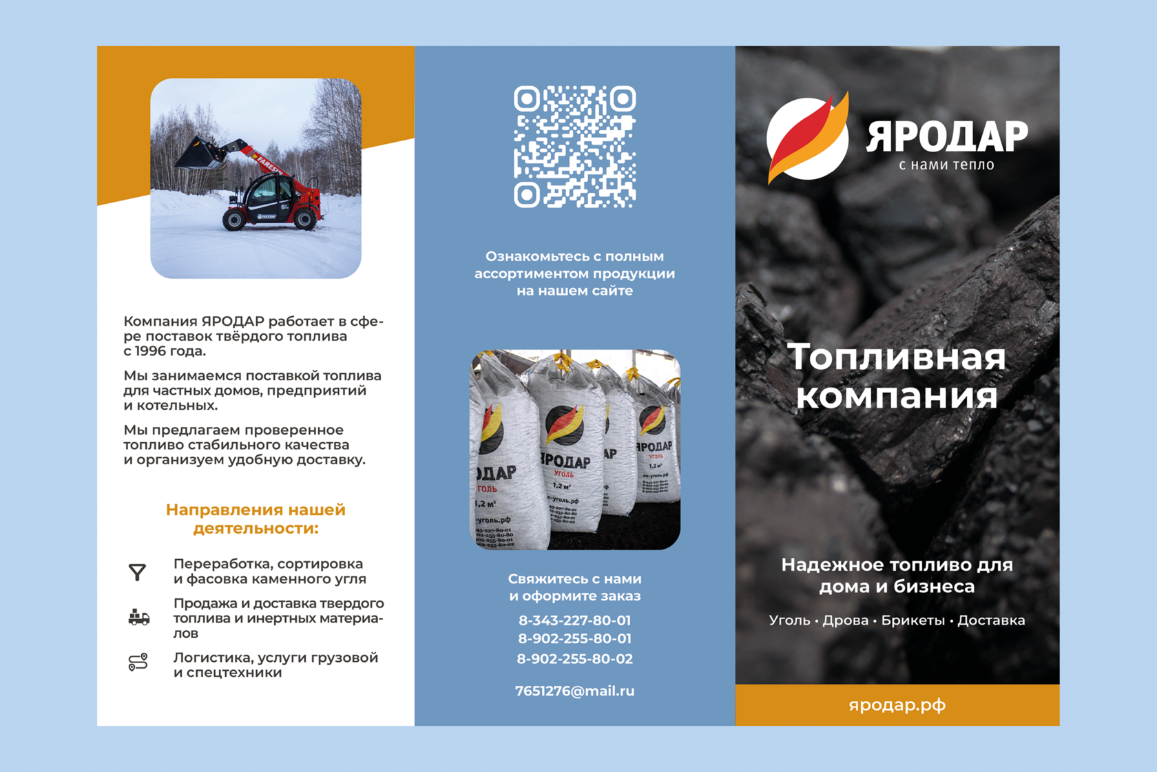
Brochure for Yarodar company
р.
р.


More projects
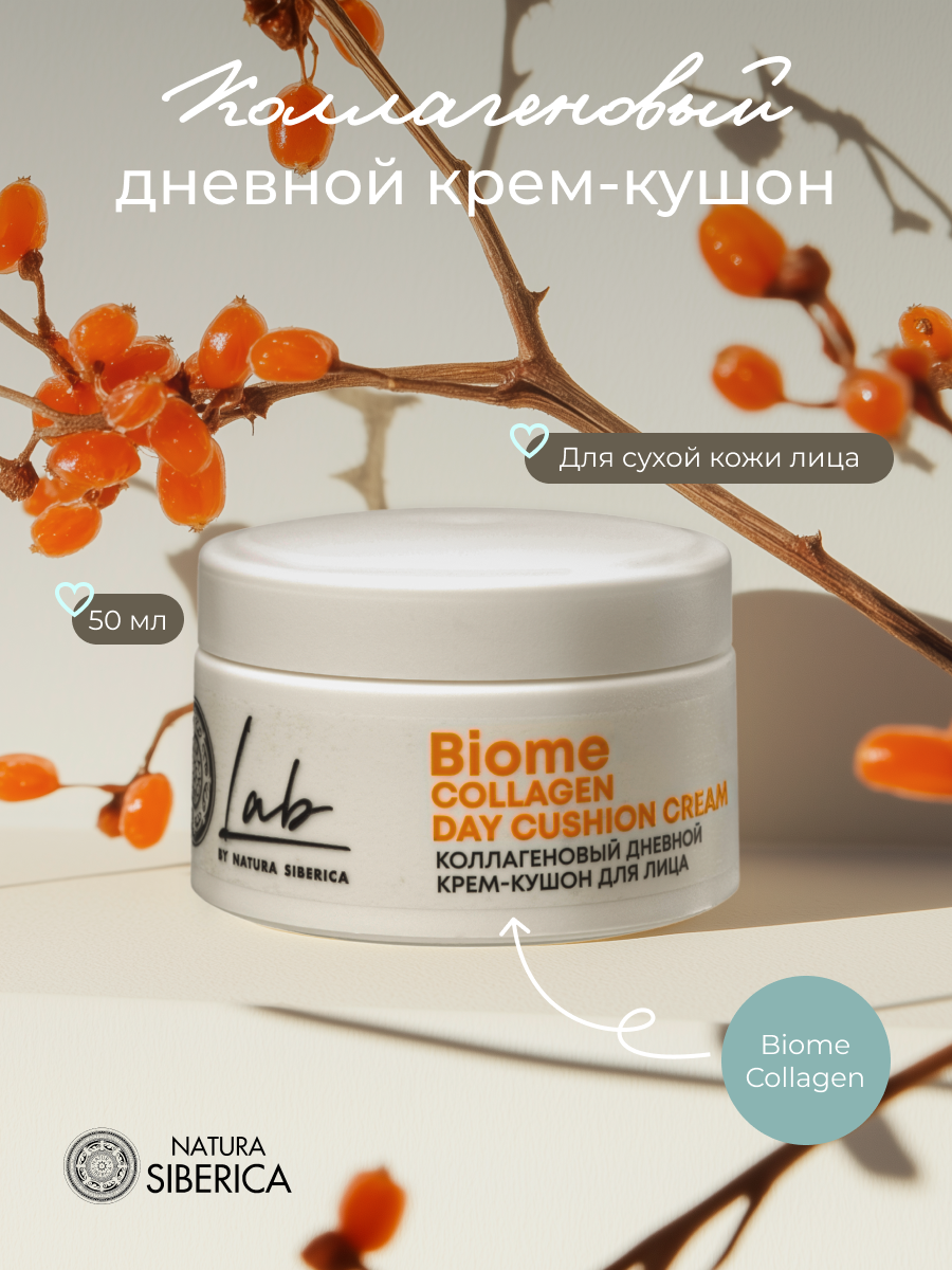

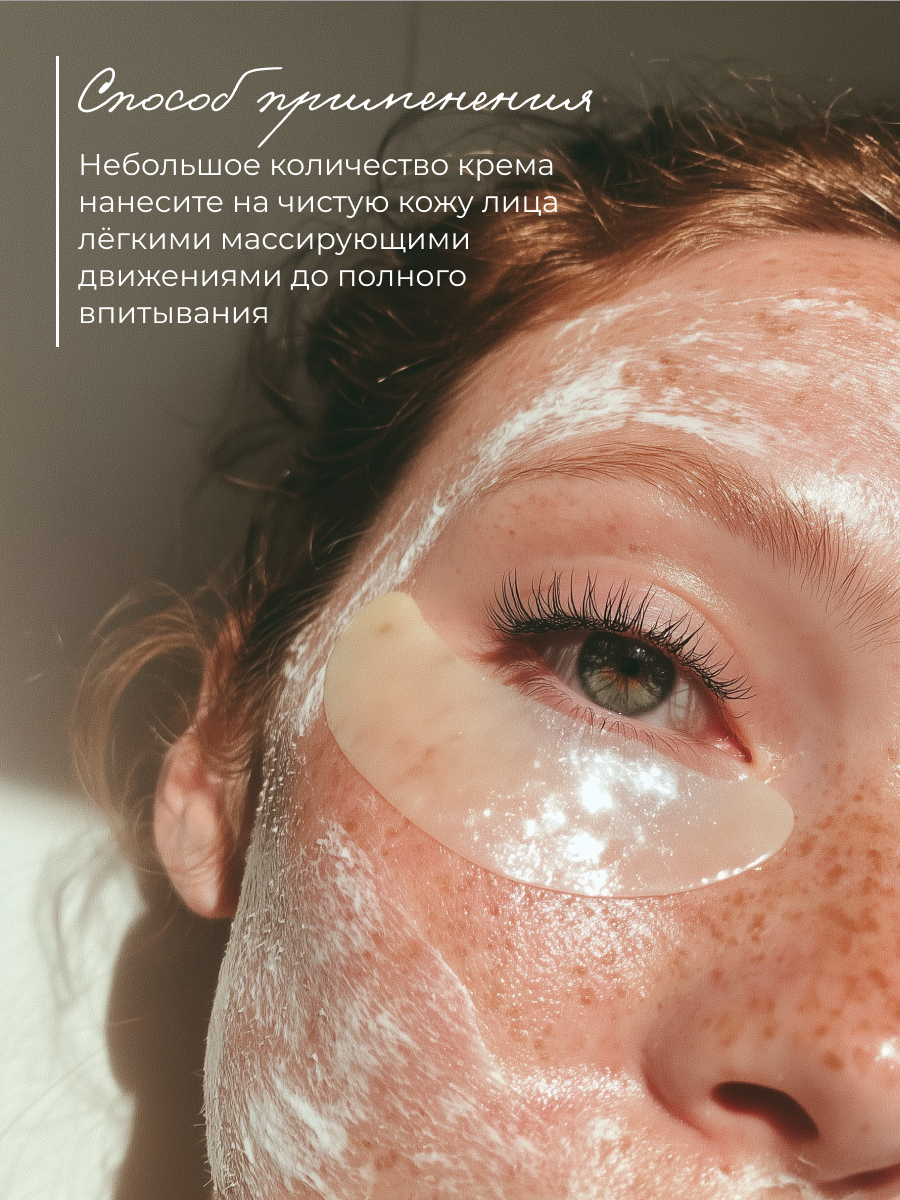
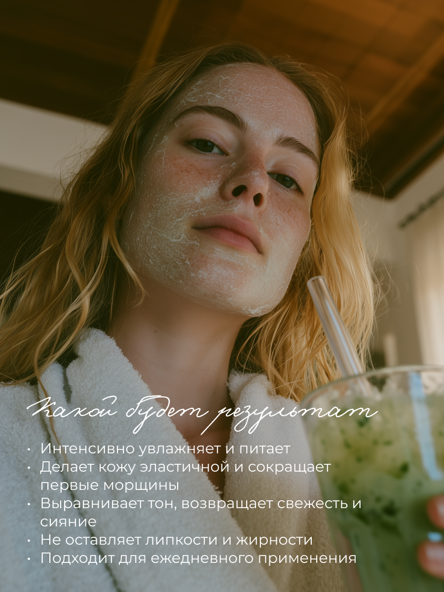
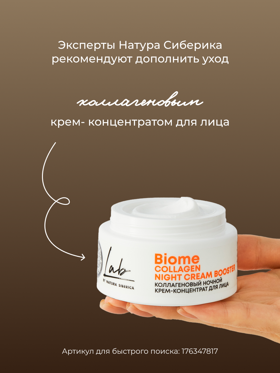
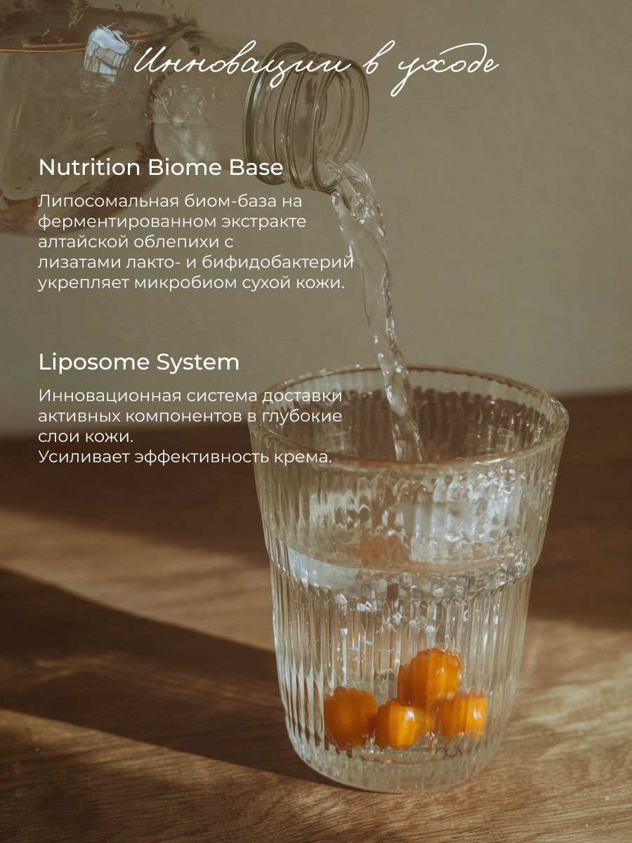
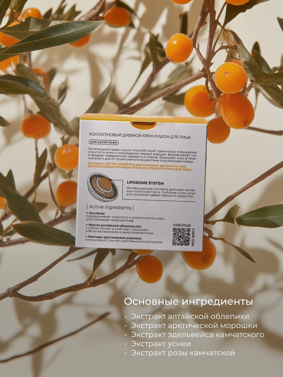
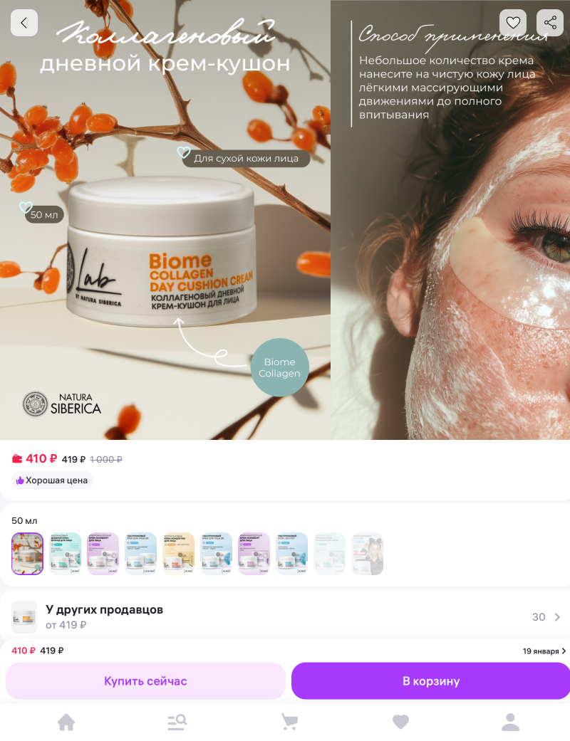
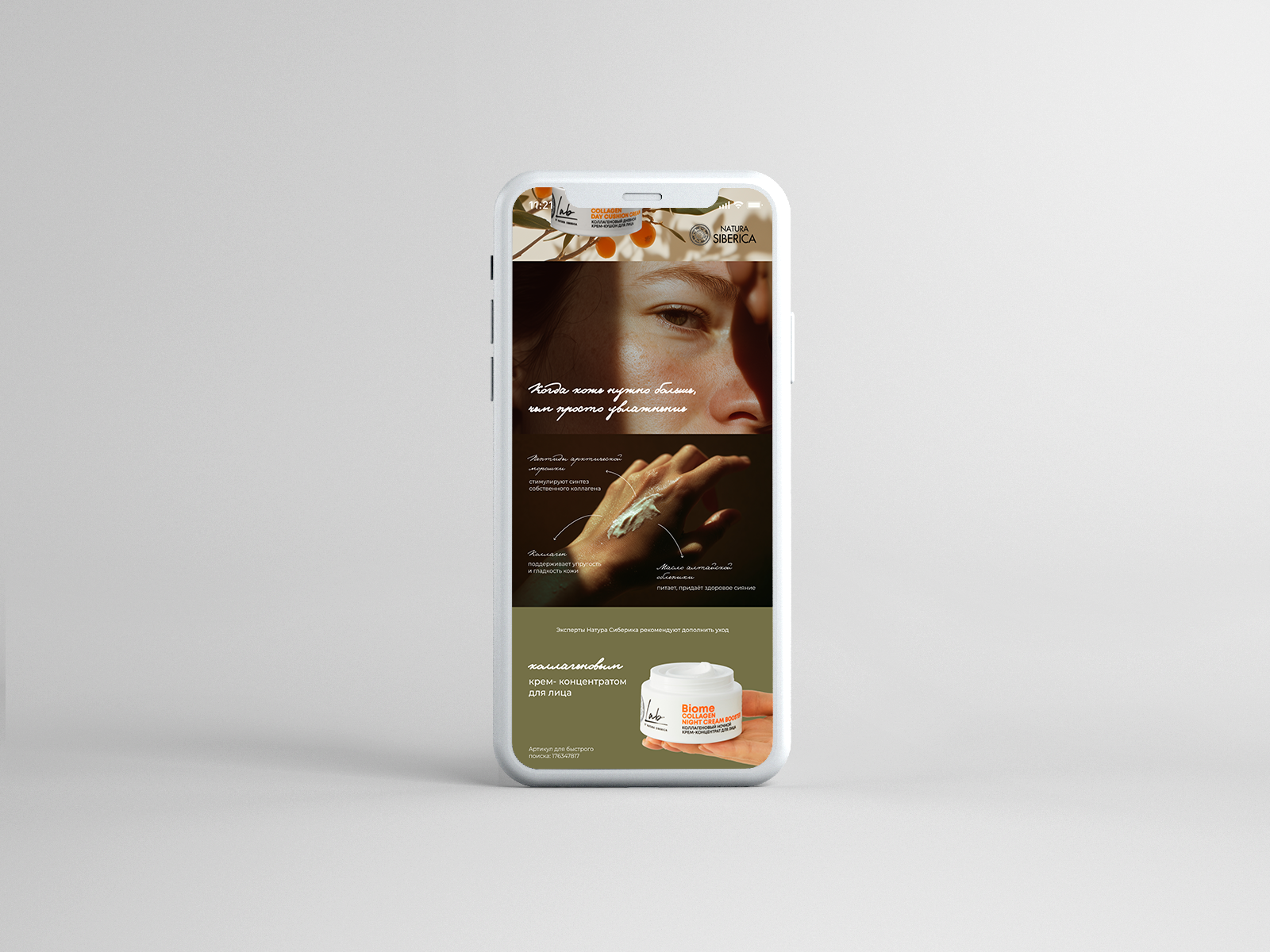
Cosmetic product cards for online marketplace "Wildberries"
р.
р.
Project Overview
This project focuses on designing product cards for an online marketplace, featuring a skincare product by Natura Siberica. The objective was to create a visually refined and engaging presentation that clearly communicates the product’s key benefits, ingredients, and texture. A key goal was to develop a visual language that feels friendly and pleasant, while remaining modern and relevant. The overall aesthetic is built around softness, natural light, and organic elements, reflecting the brand’s connection to nature. AI-generated imagery was used for the backgrounds to enhance the visual atmosphere and create cohesive, controlled compositions. Careful attention was given to composition, typography, and hierarchy to ensure clarity, readability, and strong visual impact.
About the Platform
Wildberries is one of the largest e-commerce marketplaces in Eastern Europe, offering a wide range of products, including beauty and skincare. Product cards are a crucial part of the platform, as they serve as the main point of interaction between the brand and the customer, directly influencing perception and purchase decisions.
This project focuses on designing product cards for an online marketplace, featuring a skincare product by Natura Siberica. The objective was to create a visually refined and engaging presentation that clearly communicates the product’s key benefits, ingredients, and texture. A key goal was to develop a visual language that feels friendly and pleasant, while remaining modern and relevant. The overall aesthetic is built around softness, natural light, and organic elements, reflecting the brand’s connection to nature. AI-generated imagery was used for the backgrounds to enhance the visual atmosphere and create cohesive, controlled compositions. Careful attention was given to composition, typography, and hierarchy to ensure clarity, readability, and strong visual impact.
About the Platform
Wildberries is one of the largest e-commerce marketplaces in Eastern Europe, offering a wide range of products, including beauty and skincare. Product cards are a crucial part of the platform, as they serve as the main point of interaction between the brand and the customer, directly influencing perception and purchase decisions.
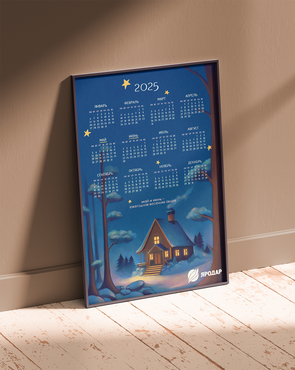
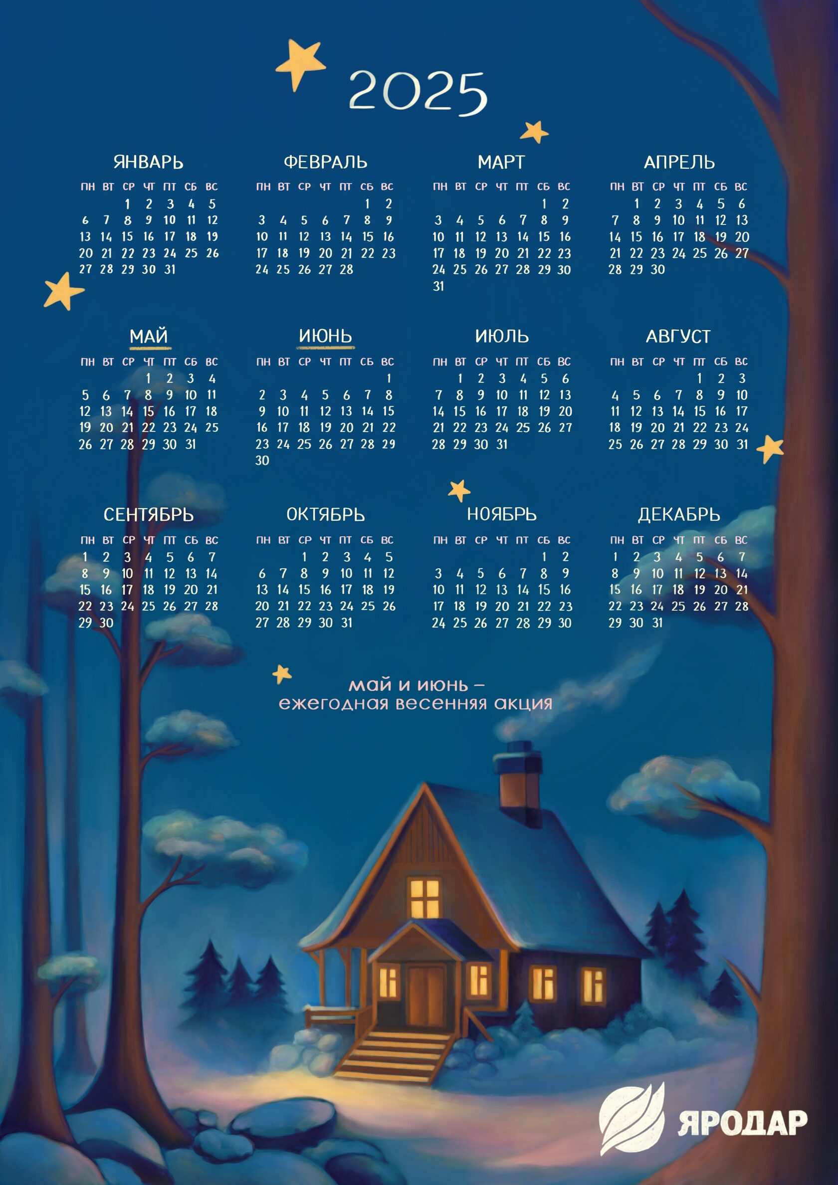
Calendar poster for Yarodar company
р.
р.
This project was developed for the Yarodar company in order to attract new customers through the emotional impact and aesthetic appeal of products, as well as maintaining the company’s image, increasing its recognition among the target audience and forming associations with warmth, comfort and harmony with nature.
link to the project on Behance: Calendar poster for Yarodar company :: Behance
link to the project on Behance: Calendar poster for Yarodar company :: Behance


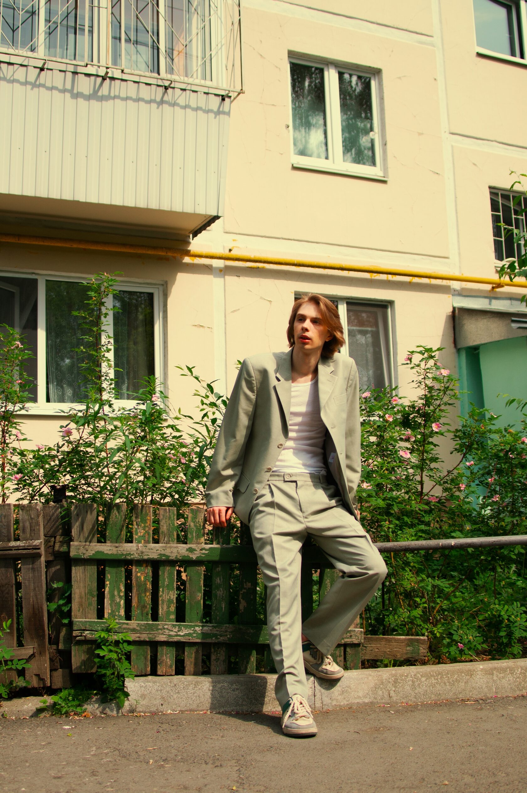
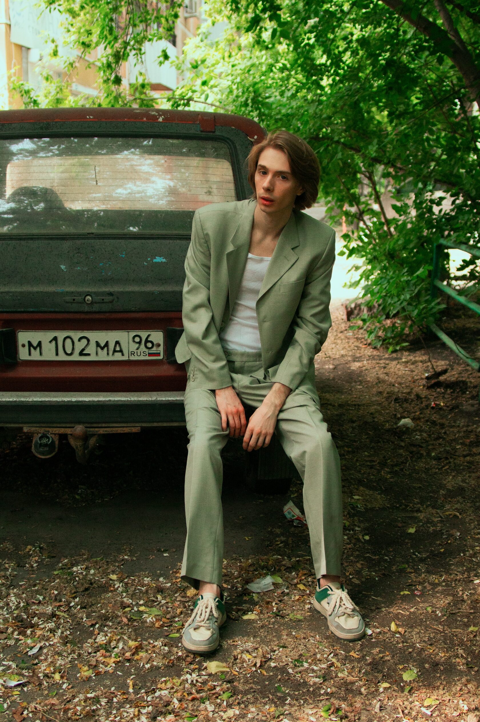
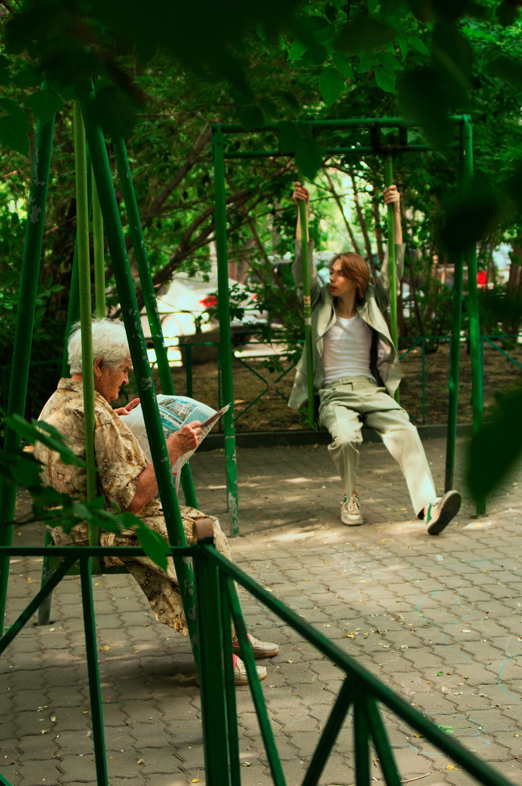

"Quiet Summer" photoshoot
р.
р.


More projects
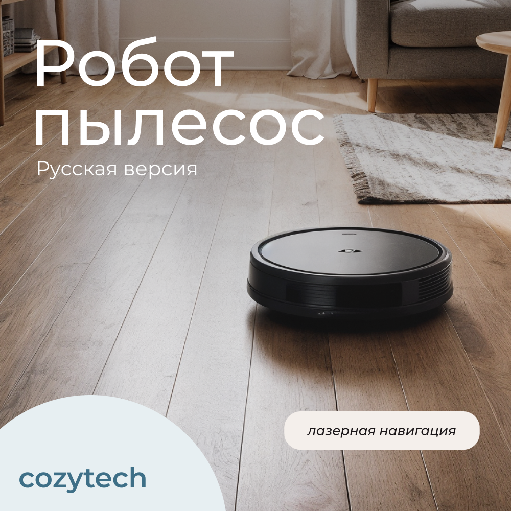
Cozytech — Visual content for VK
р.
р.
Project Overview
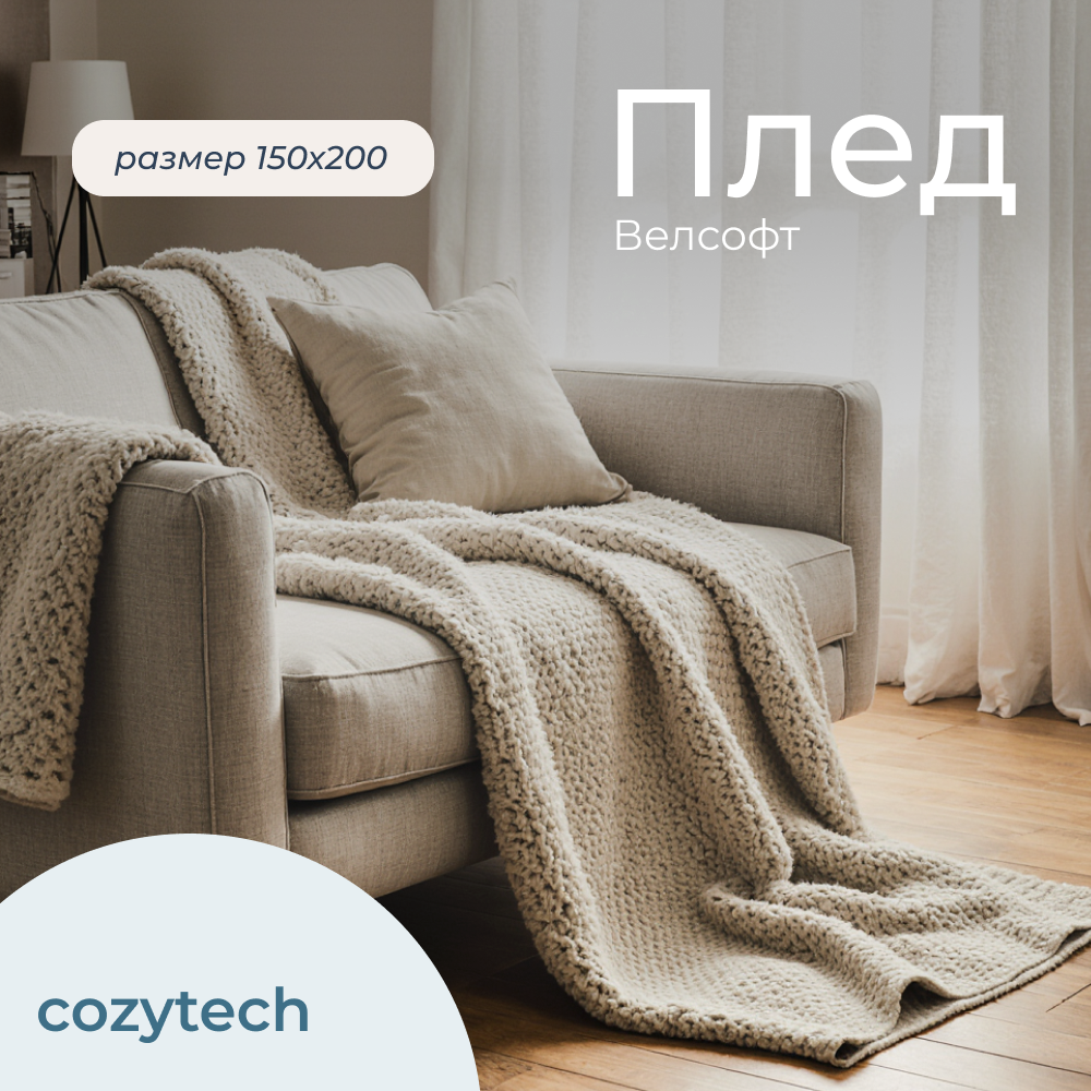
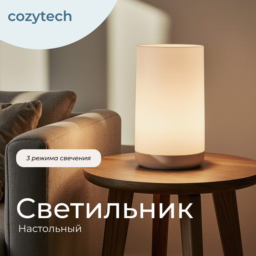
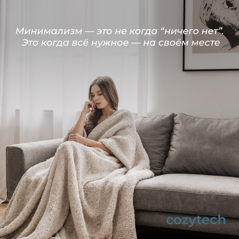
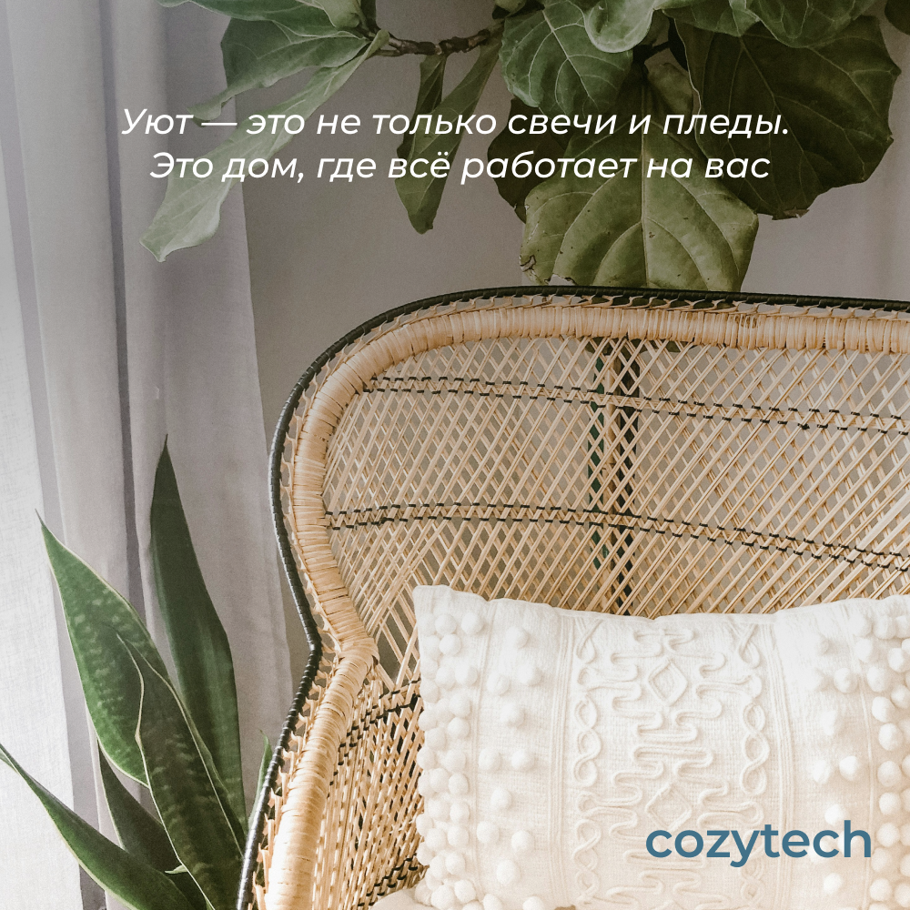
This project focuses on creating visual content for VK, including product cards and social media posts for the Cozytech brand. The goal was to develop a clean and cohesive visual system that presents home goods in a warm, approachable way. The design emphasizes softness, neutral tones, and a sense of everyday comfort, helping to clearly communicate product features while maintaining a calm and inviting atmosphere. All background images were created using AI, allowing for consistent lighting, composition, and mood across the visuals.
About the Platform
VK (VKontakte) is one of the largest social media platforms in Eastern Europe. It combines features of social networking and e-commerce, allowing brands to showcase products, publish content, and interact directly with their audience. Visual content plays a key role on the platform, shaping brand perception and supporting user engagement.
This project focuses on creating visual content for VK, including product cards and social media posts for the Cozytech brand. The goal was to develop a clean and cohesive visual system that presents home goods in a warm, approachable way. The design emphasizes softness, neutral tones, and a sense of everyday comfort, helping to clearly communicate product features while maintaining a calm and inviting atmosphere. All background images were created using AI, allowing for consistent lighting, composition, and mood across the visuals.
About the Platform
VK (VKontakte) is one of the largest social media platforms in Eastern Europe. It combines features of social networking and e-commerce, allowing brands to showcase products, publish content, and interact directly with their audience. Visual content plays a key role on the platform, shaping brand perception and supporting user engagement.
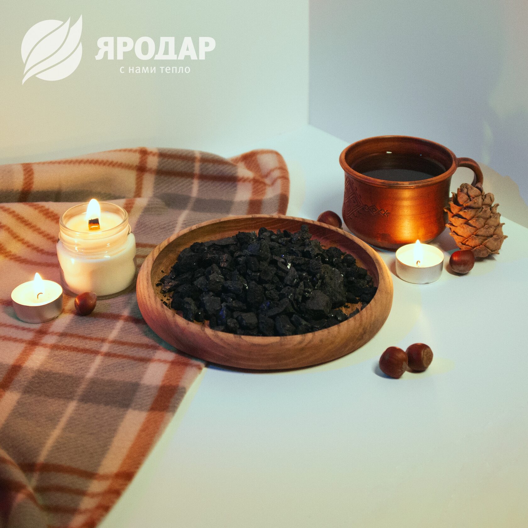
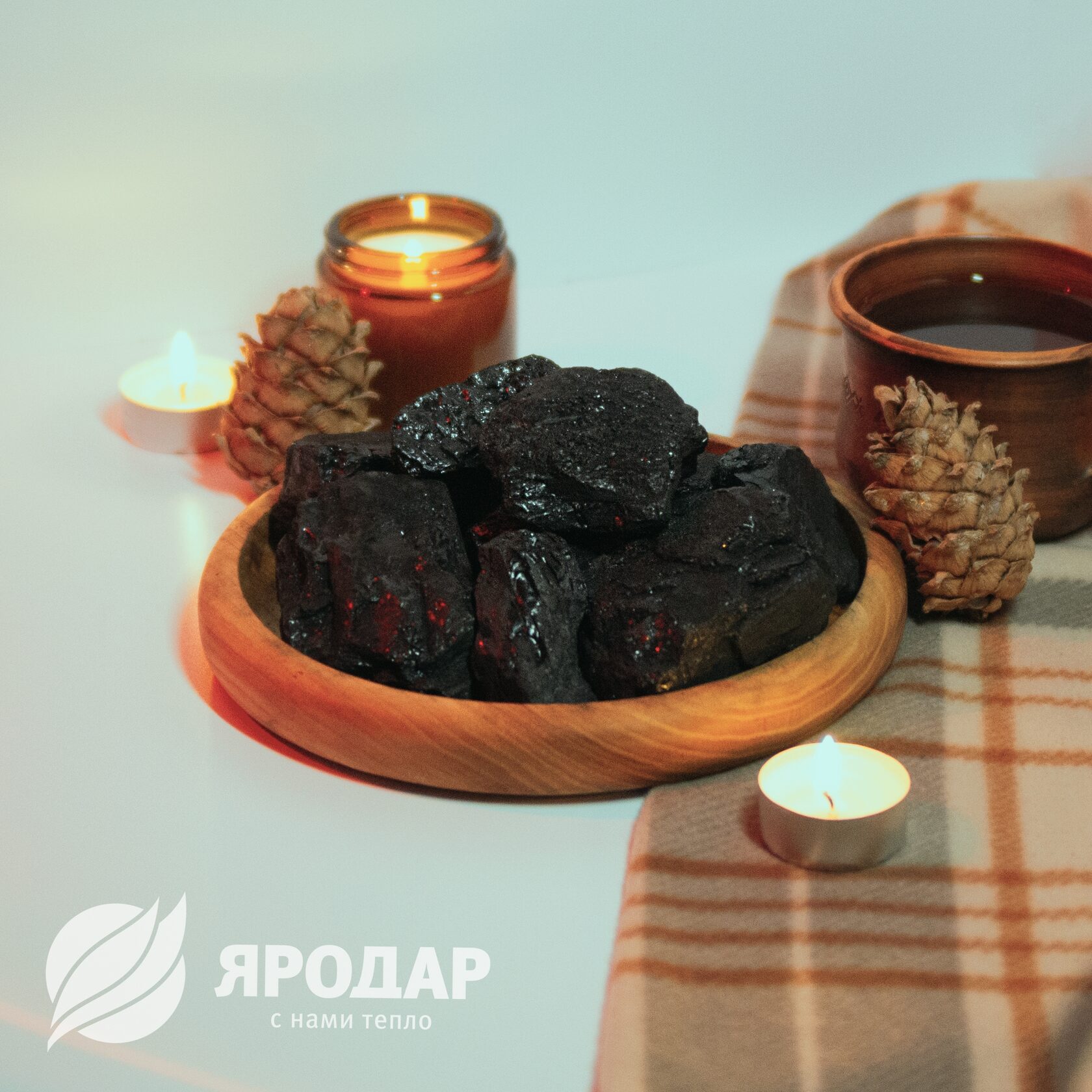
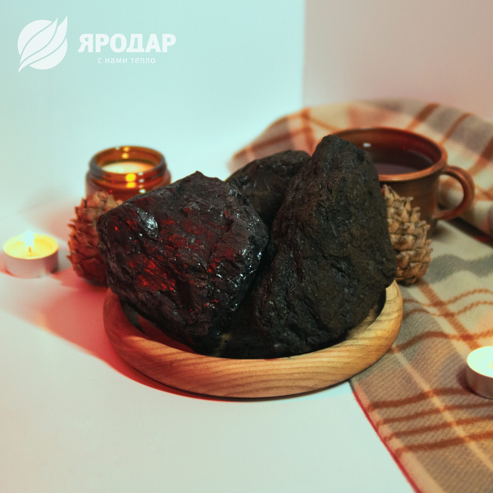
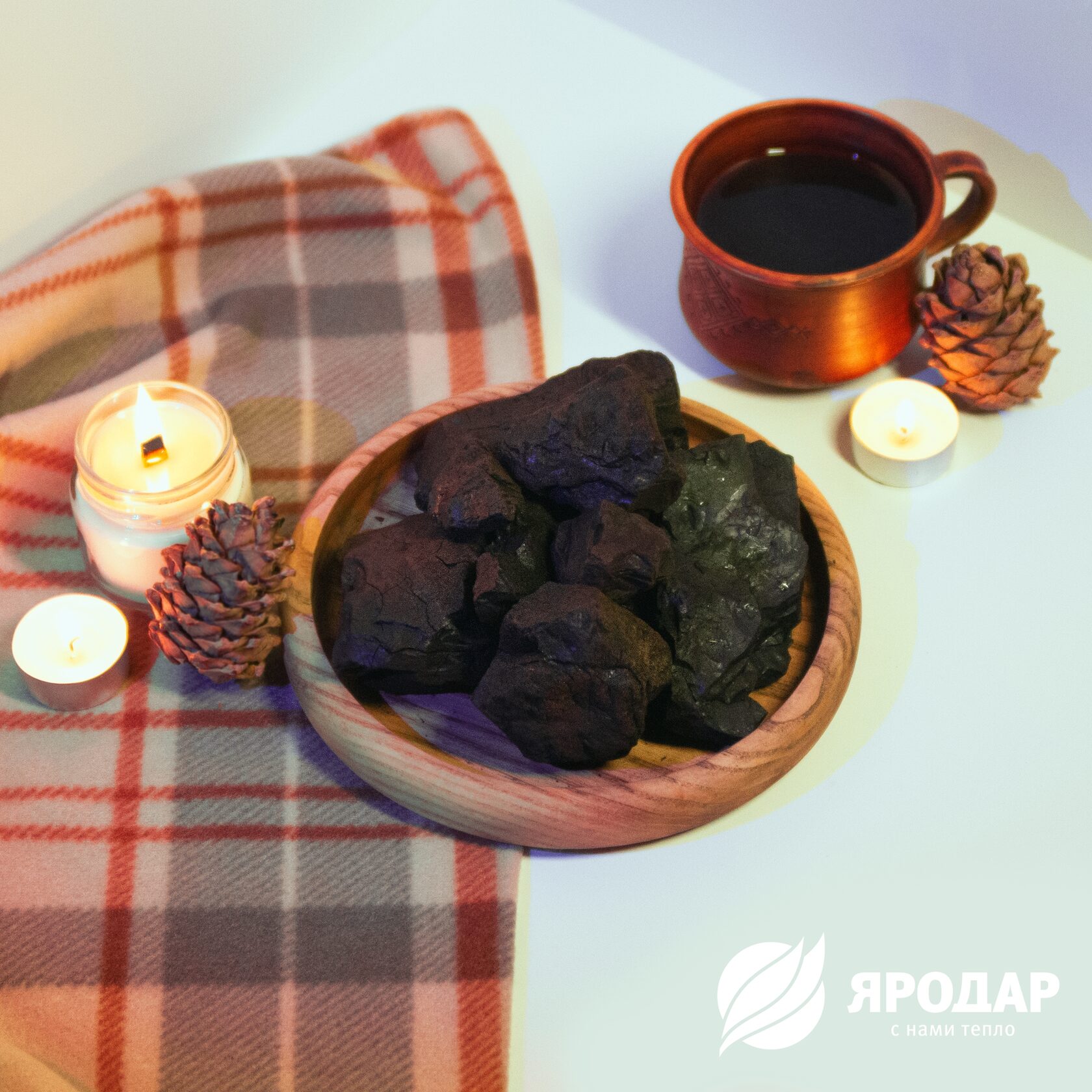
Product сards photoshoot for Yarodar
р.
р.
A series of product photographs created for Yarodar’s digital product cards and online communication. The project focuses on presenting the product through a warm, atmospheric visual language that reflects the brand’s identity and its connection with comfort, warmth, and natural materials.
The composition creates cozy and recognizable brand mood. Soft lighting, warm accents, and clean product placement help make the images suitable for product cards, social media posts, and website visuals while maintaining a consistent and professional visual style.
The composition creates cozy and recognizable brand mood. Soft lighting, warm accents, and clean product placement help make the images suitable for product cards, social media posts, and website visuals while maintaining a consistent and professional visual style.


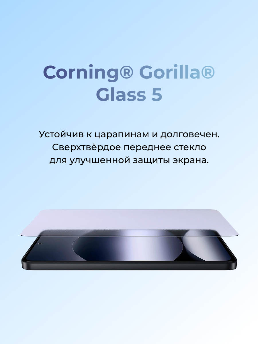
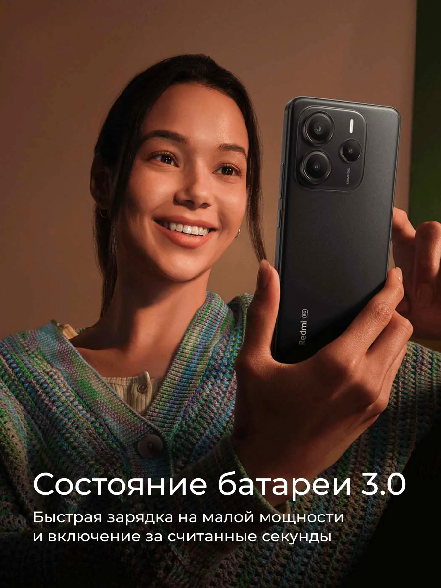
Marketplace product cards for Redmi
р.
р.
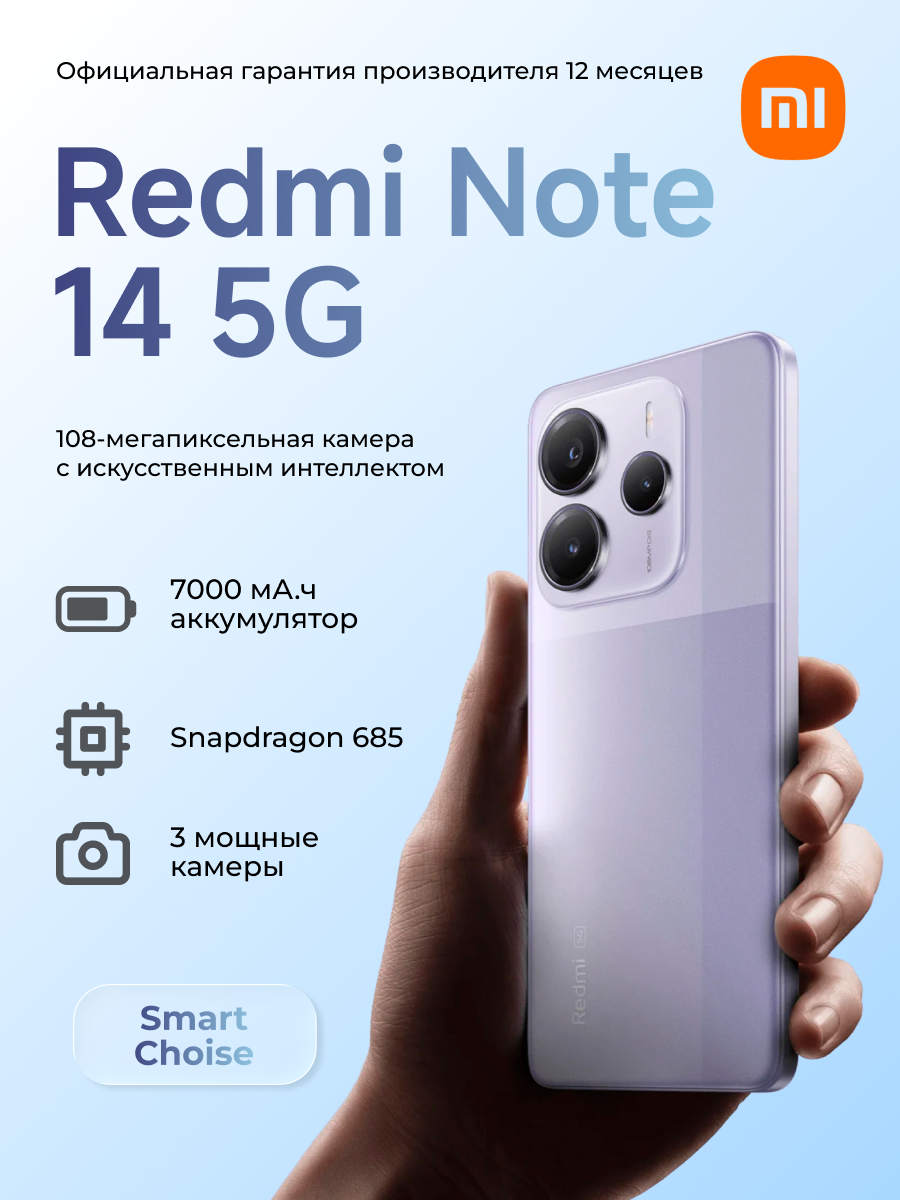
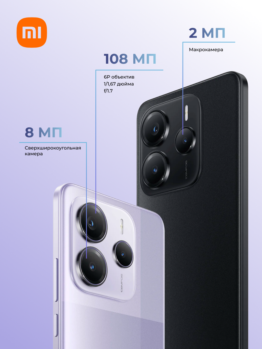
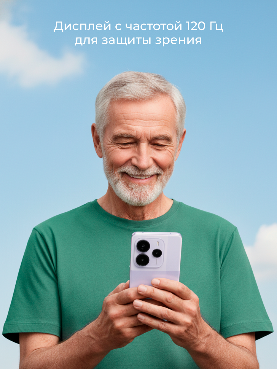
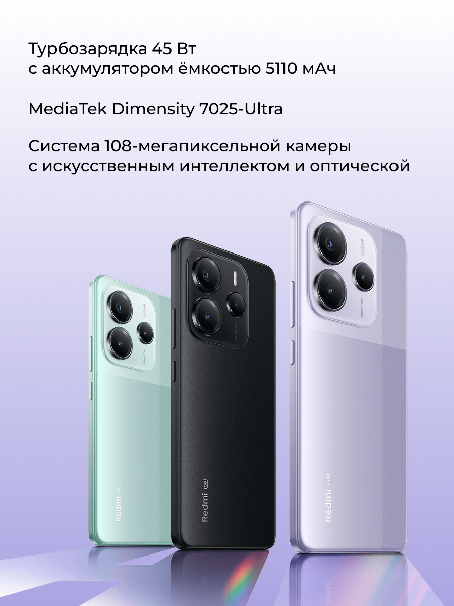
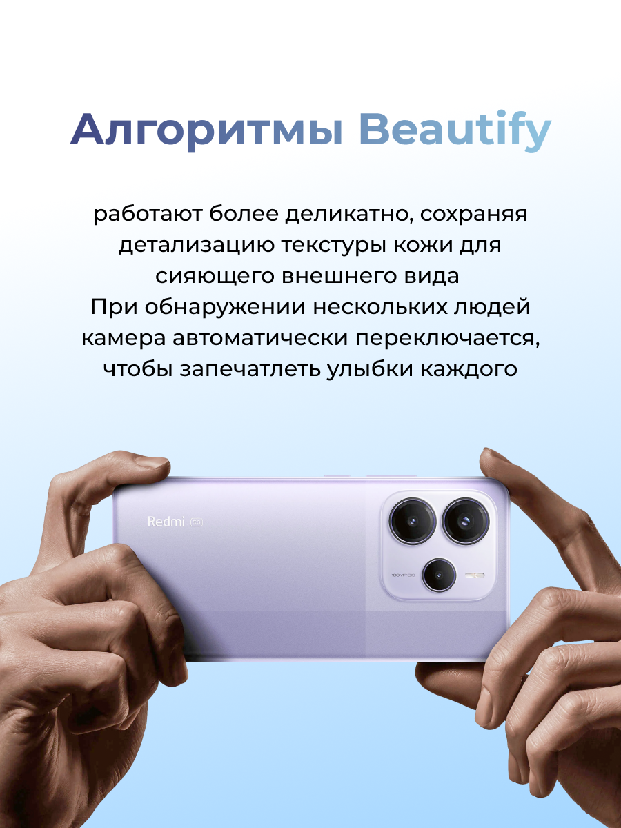
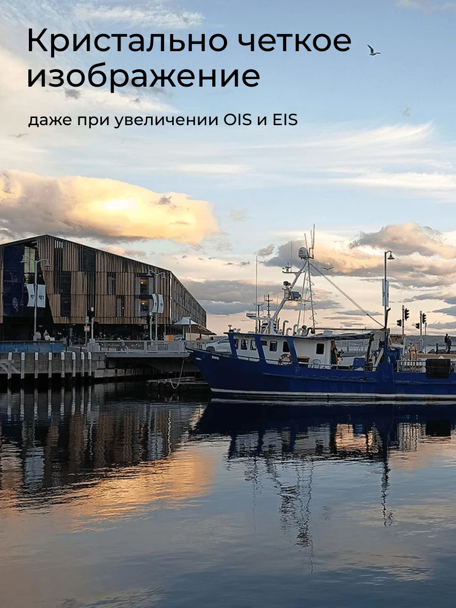
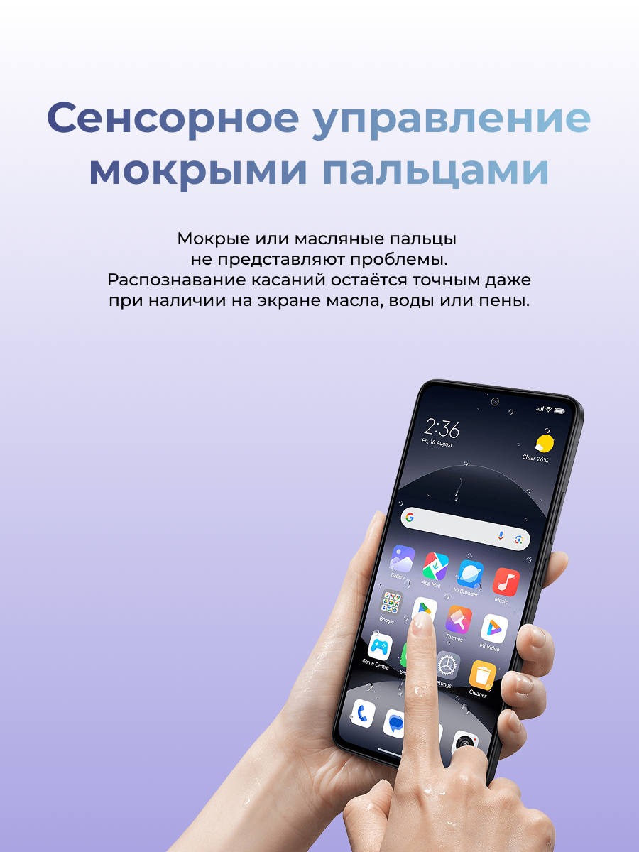
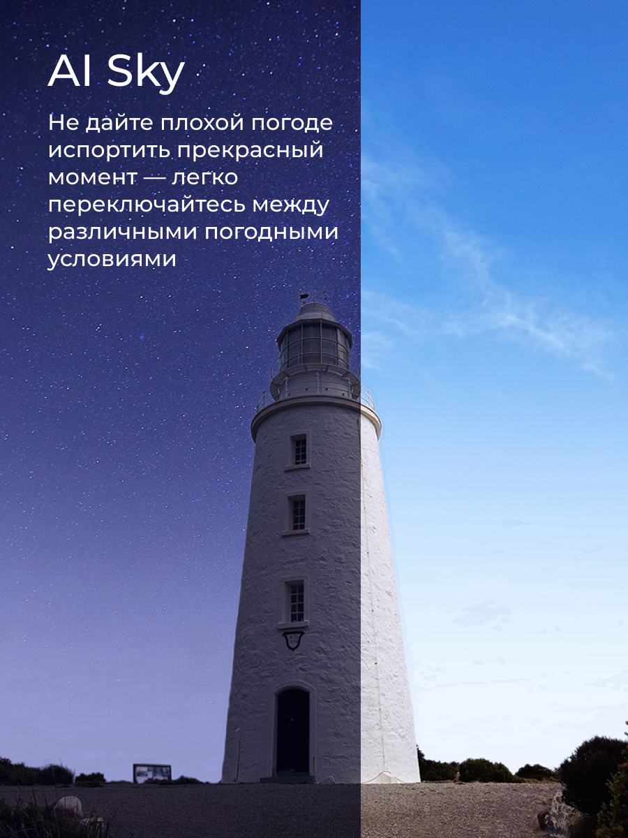
Design of marketplace product cards for Redmi Note 14 5G focused on clear visual hierarchy, product presentation, and audience-oriented communication. The project included the development of a modern and clean visual style adapted for e-commerce platforms, highlighting key product features through typography and composition.
The main goal was to create visually engaging and informative product cards that improve readability, emphasize the product’s advantages, and maintain a recognizable brand aesthetic across different marketplace formats.
The main goal was to create visually engaging and informative product cards that improve readability, emphasize the product’s advantages, and maintain a recognizable brand aesthetic across different marketplace formats.


More projects

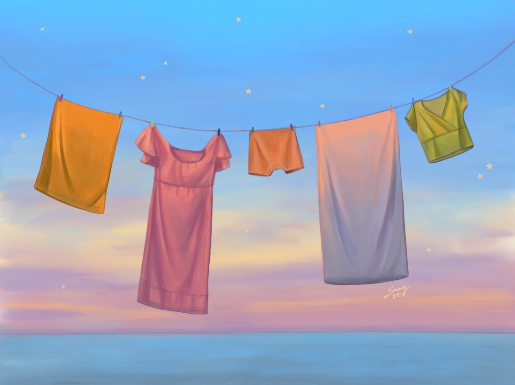
Personal artworks — Before the Moon says goodnight
р.
р.
These illustrations are about the quiet joys we often pass by without noticing, about simple comfort that makes the world feel a little kinder and warmer.
link to the project on Behance: Personal artworks — Before the Moon Says Goodnight :: Behance
link to the project on Behance: Personal artworks — Before the Moon Says Goodnight :: Behance

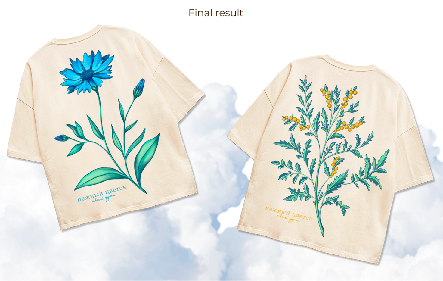
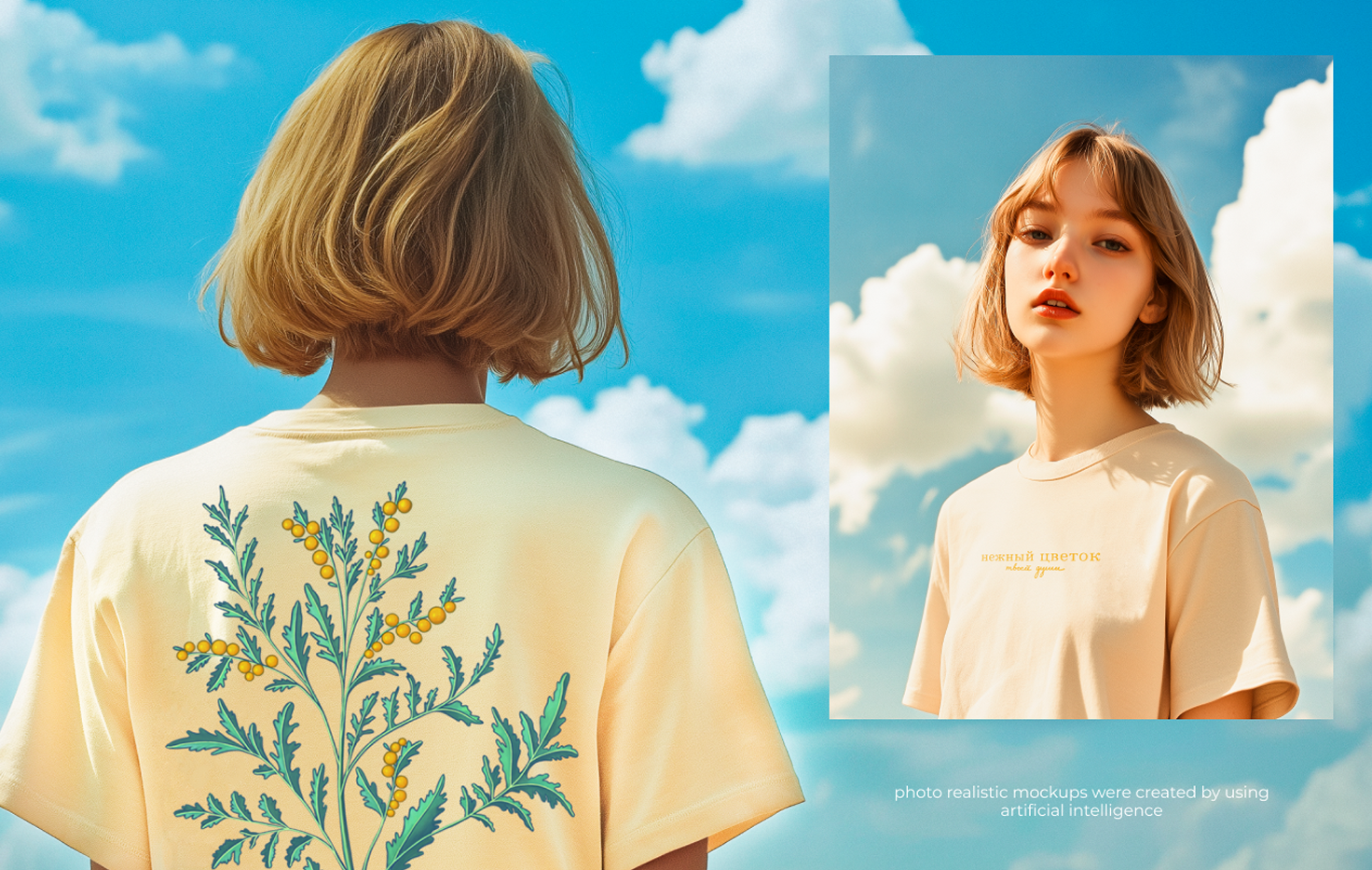
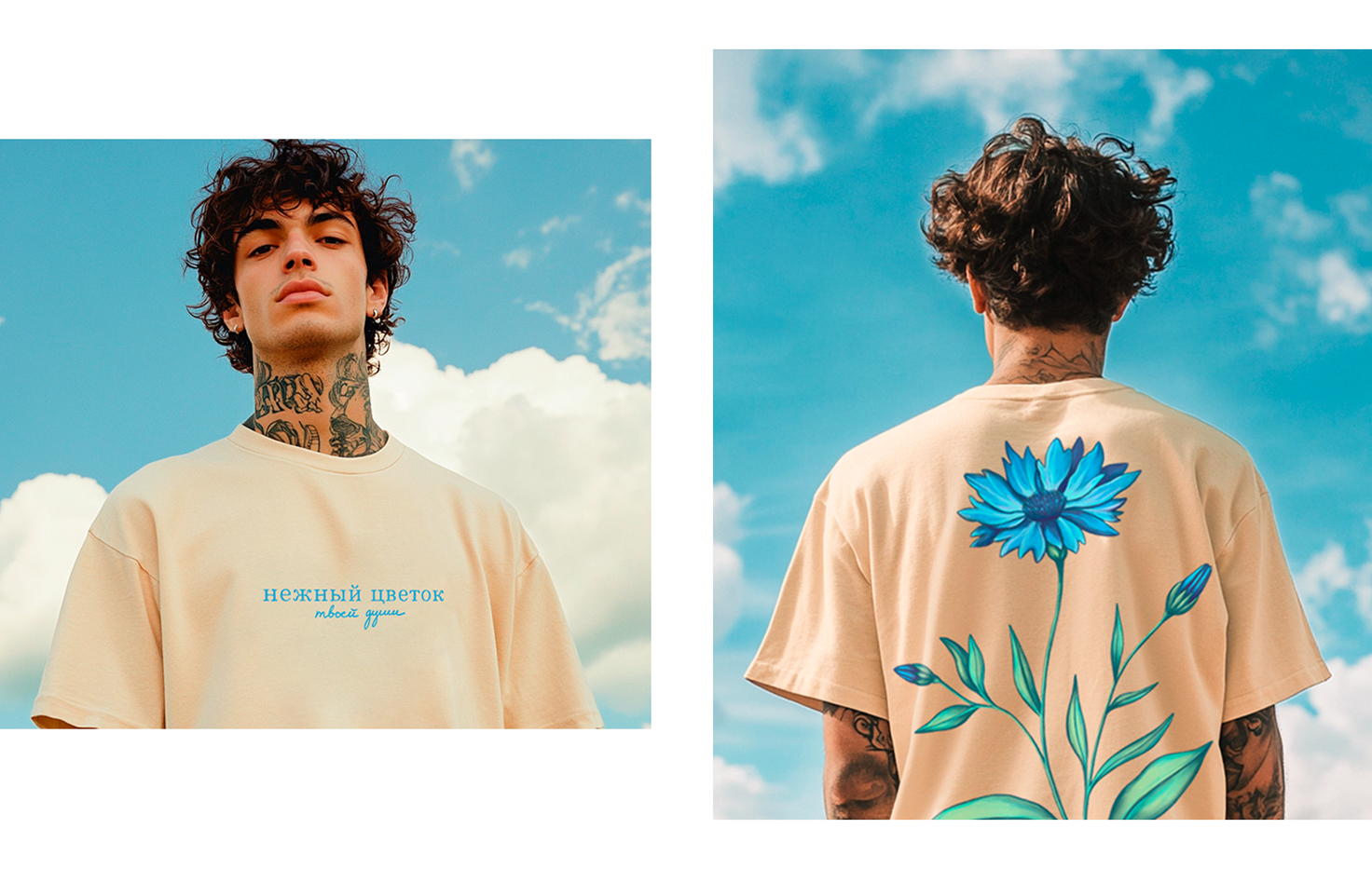
The gentle flower of your soul -
t-shirt illustrations
t-shirt illustrations
р.
р.
In every soul lives a flower, quiet, gentle, and brave.
This project is a dedication to those invisible flowers that bloom within us and beside us. Each illustration is inspired by real plants that grow across the vast landscapes of Russia, wild, free, and often unnoticed. Within them is a piece of my home, my memories, and a quiet longing for beauty rooted in simplicity.
link to the project on Behance: The Gentle Flower of Your Soul - t-shirt illustrations :: Behance
This project is a dedication to those invisible flowers that bloom within us and beside us. Each illustration is inspired by real plants that grow across the vast landscapes of Russia, wild, free, and often unnoticed. Within them is a piece of my home, my memories, and a quiet longing for beauty rooted in simplicity.
link to the project on Behance: The Gentle Flower of Your Soul - t-shirt illustrations :: Behance
Dates of Bliss — A minimal packaging concept
р.
р.
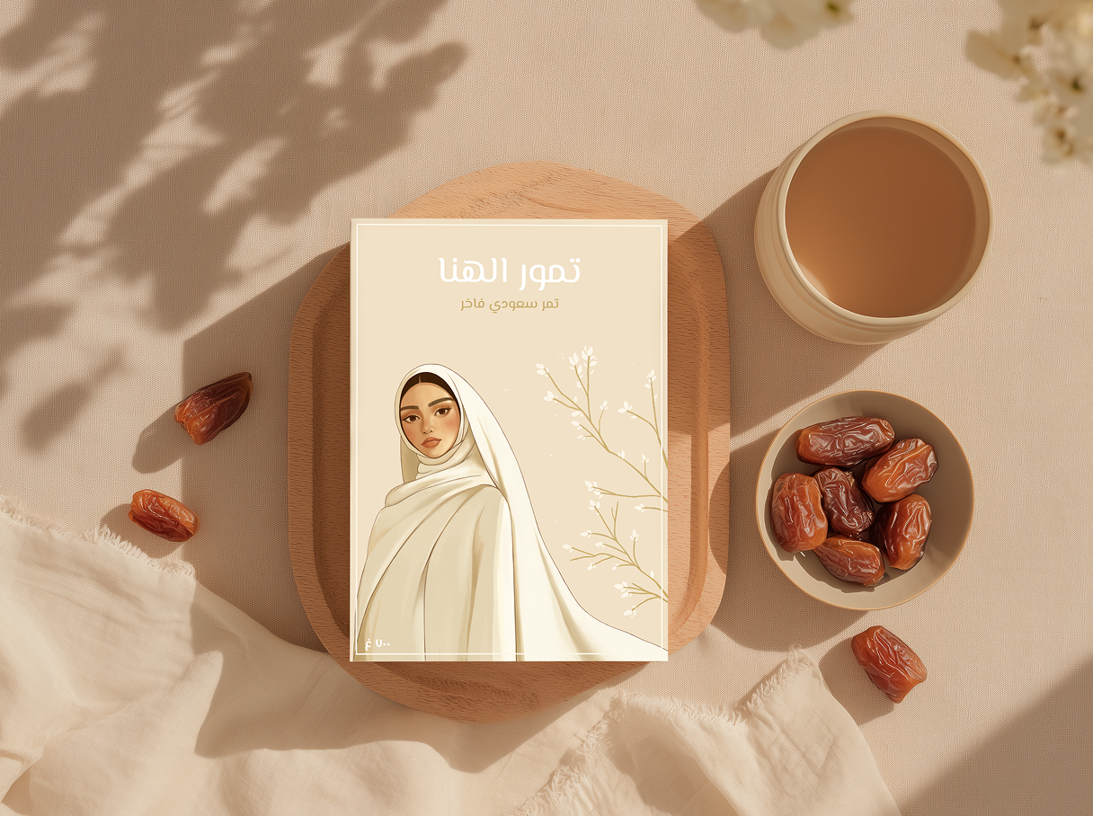
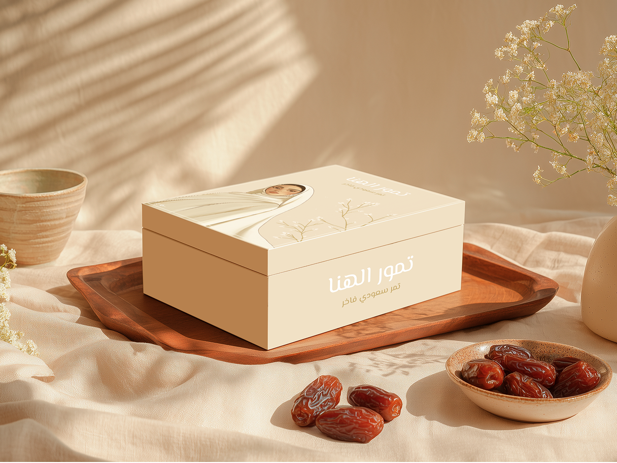
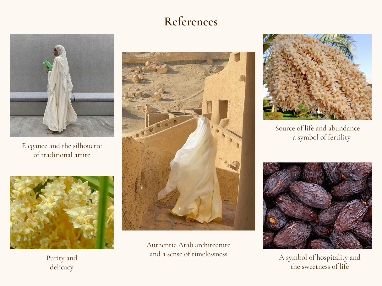
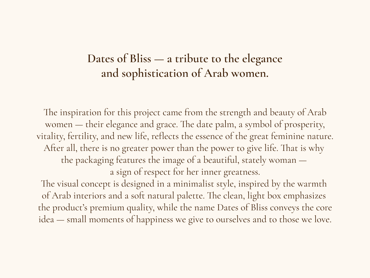
Dates of Bliss is a minimalist packaging concept for premium dates, inspired by the elegance, strength, and dignity of Arab women. The visual language combines a refined female silhouette with the symbolic meaning of the date palm — a timeless emblem of life, abundance, and prosperity.
The design is intentionally restrained, using soft sandy tones and clean compositions to create a calm, warm, and premium atmosphere. Minimal details allow the concept to focus on what truly matters: cultural respect, natural origin, and quiet moments of bliss.
link to the project on Behance: Dates of Bliss — A Minimal Packaging Concept :: Behance
The design is intentionally restrained, using soft sandy tones and clean compositions to create a calm, warm, and premium atmosphere. Minimal details allow the concept to focus on what truly matters: cultural respect, natural origin, and quiet moments of bliss.
link to the project on Behance: Dates of Bliss — A Minimal Packaging Concept :: Behance


More projects
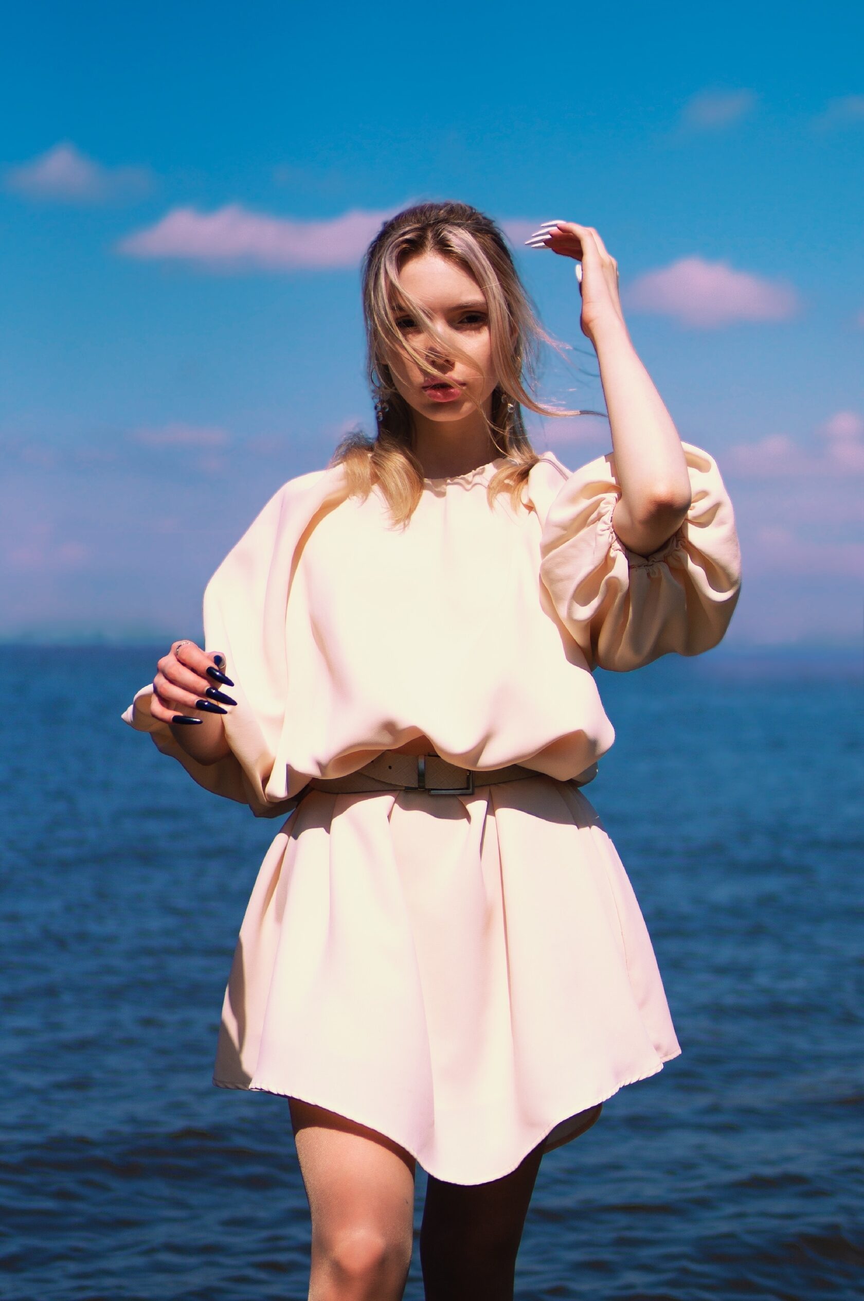
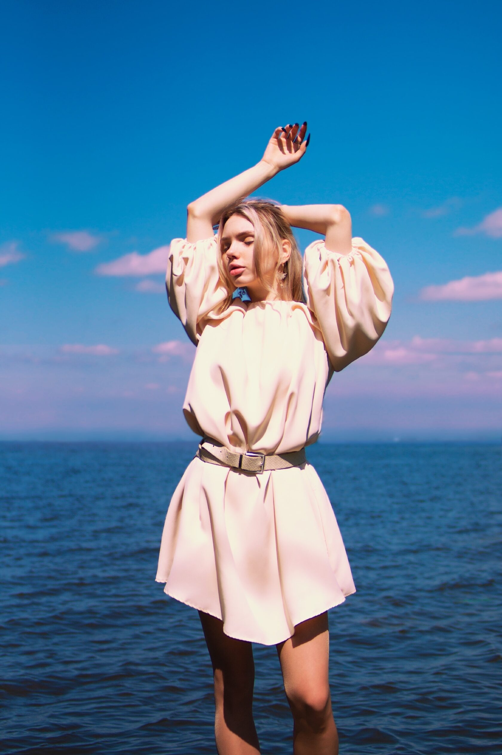
"Soft wind" photoshoot
р.
р.
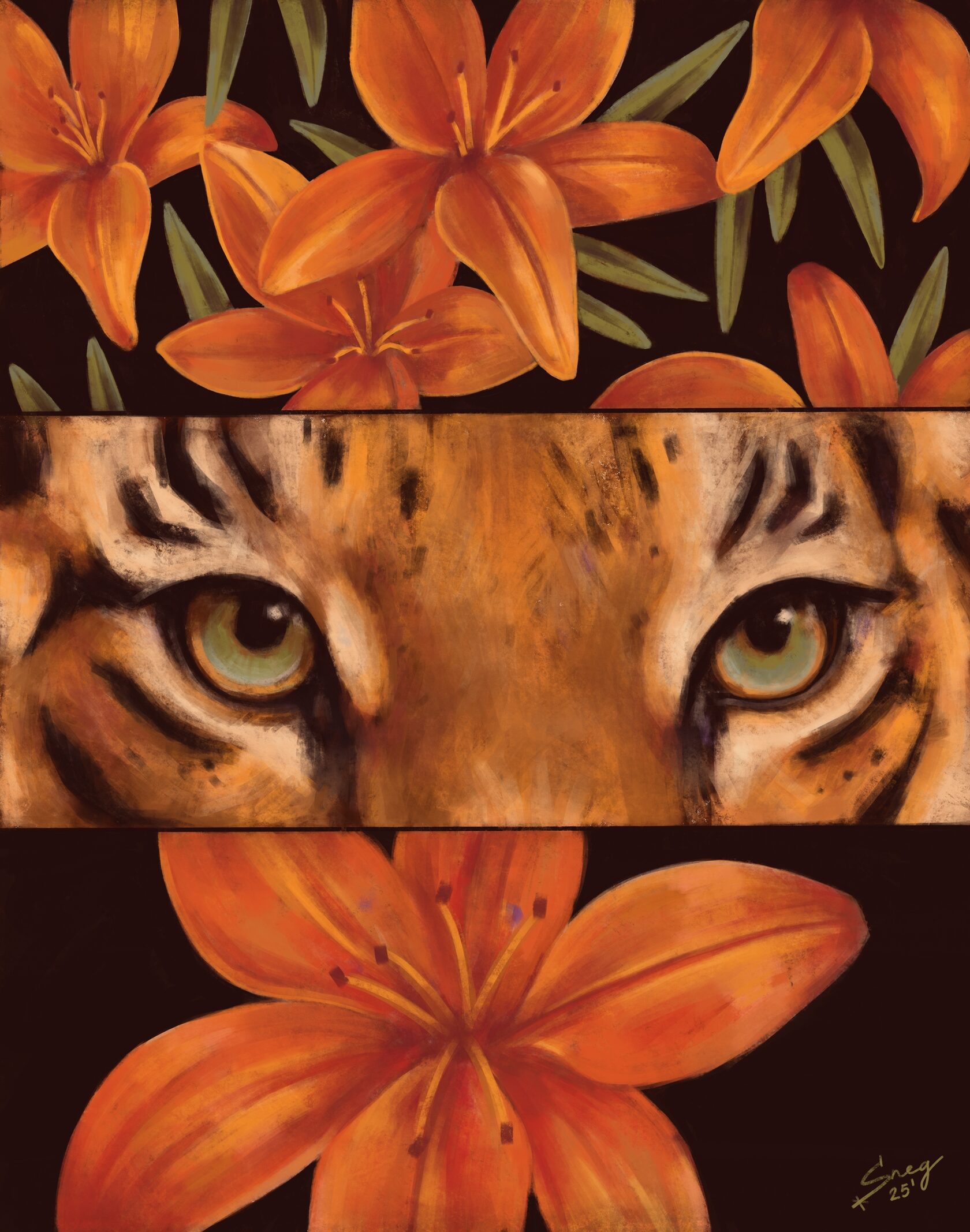
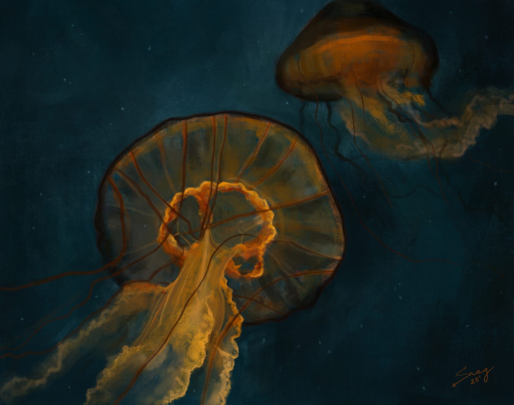
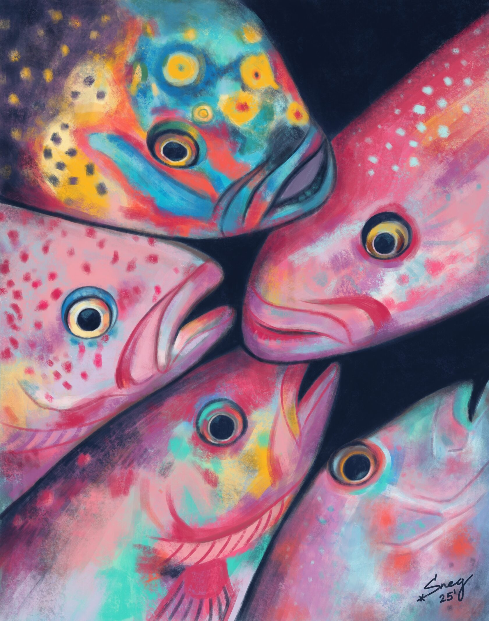
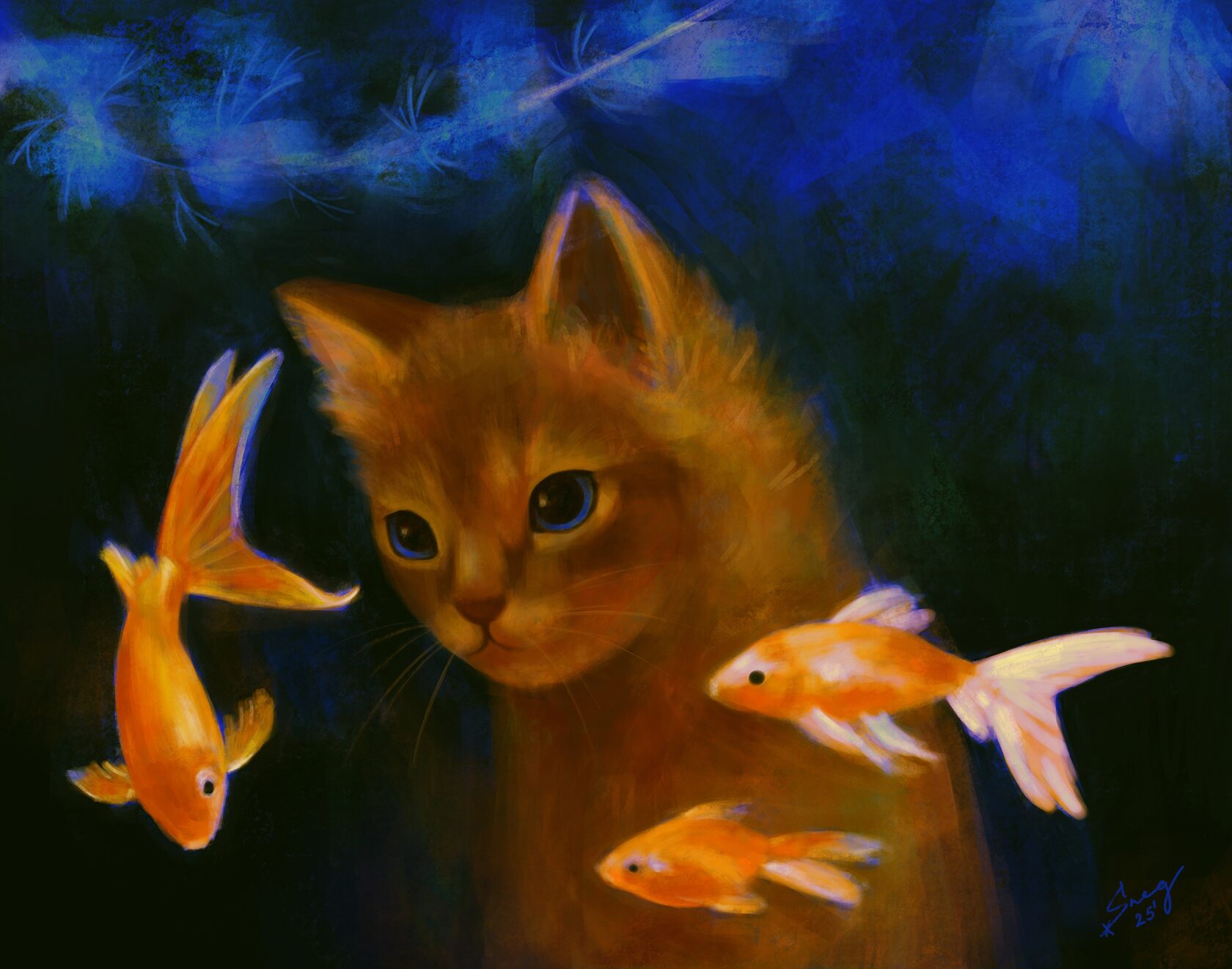
Personal artworks — Wild Echoes
р.
р.
In nature, there are no accidental movements and no empty gazes — everything reflects something within us. We are a part of this world, and it’s important not to forget that.
link to the project on Behance: Personal artworks — Wild Echoes :: Behance
link to the project on Behance: Personal artworks — Wild Echoes :: Behance
